The search experience within the Google Cloud console just got a bit easier
Cameron Greene
Product Manager, Google Cloud console
The Google Cloud console is a powerful platform that lets users manage their cloud projects end-to-end with an intuitive web-based UI. With over 120 Google Cloud products across thousands of pages, it can be challenging to navigate through the console quickly, and many users don’t like to use the command line interface. To help, Google Cloud console team recently made several improvements to our search and navigation features, making it easier to find what you need, when you need it.

Expanded resource-type search
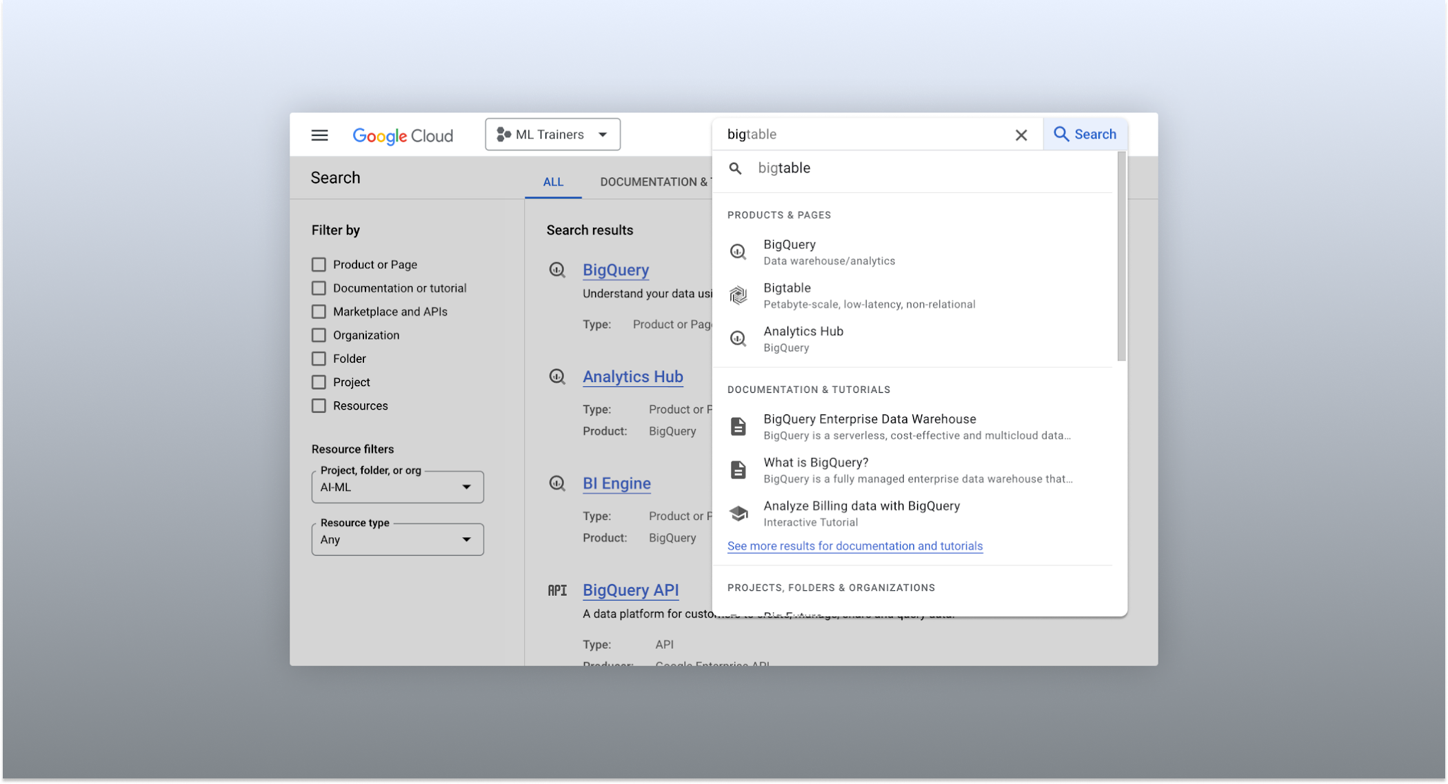
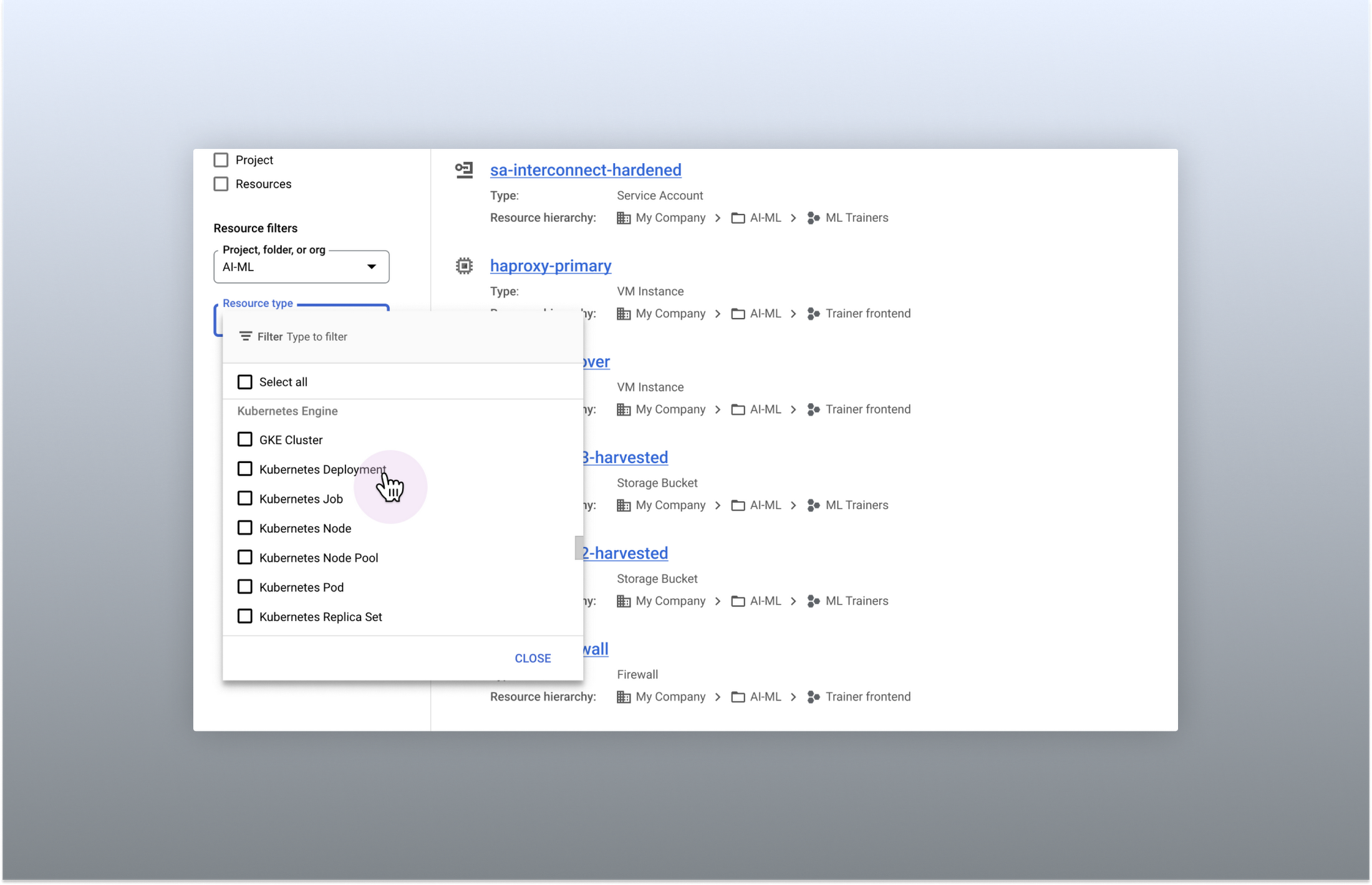
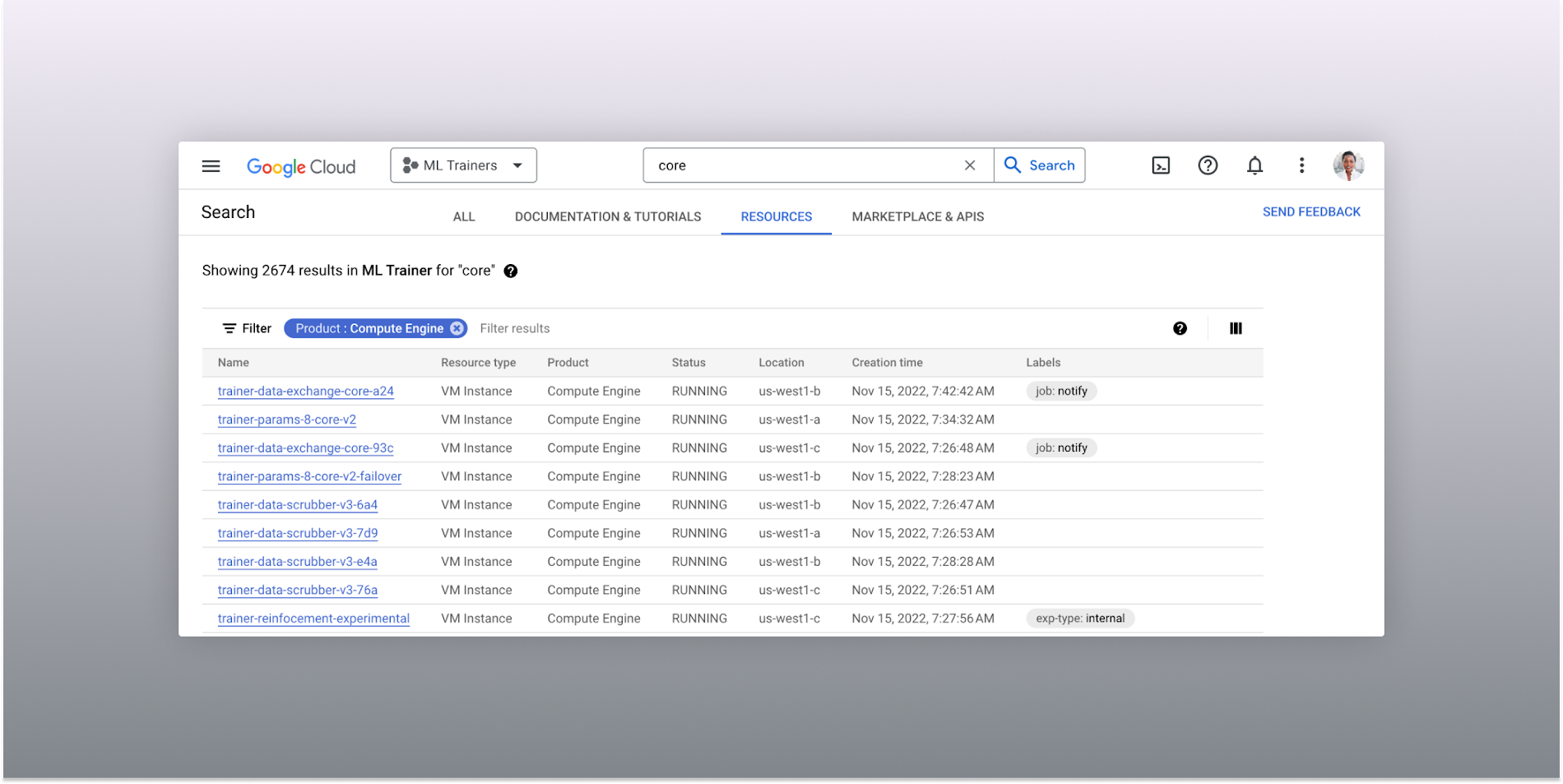
One of the most significant improvements to the console's search feature is the increased resource-type coverage. You can now find instances of nearly all of the over 120 products that Google Cloud offers directly from the search bar, rather than by manually clicking to the details section nested within specific product pages. This wider coverage saves you time compared to browsing through the different product categories to find what you're looking for. This improvement also allows the console experience team to continuously add new resource types as we develop new features and capabilities in our various product offerings.

Improved documentation search
We also improved the coverage and accuracy of the search experience for documentation, making it easier to find specific pages or interactive tutorials. Developers looking to get started with something they’re unfamiliar with may want to undertake tutorials in the context of their own working environment. Even experienced developers just looking for a quick answer to their question may not want to leave the console, so we expect these improvements can help users of all experience levels.
We’ve heard from you that finding the right documentation from within the console can be tricky, and so we hope this change can save you from needing to switch over to web search to be confident that they’ll find what you're looking for.
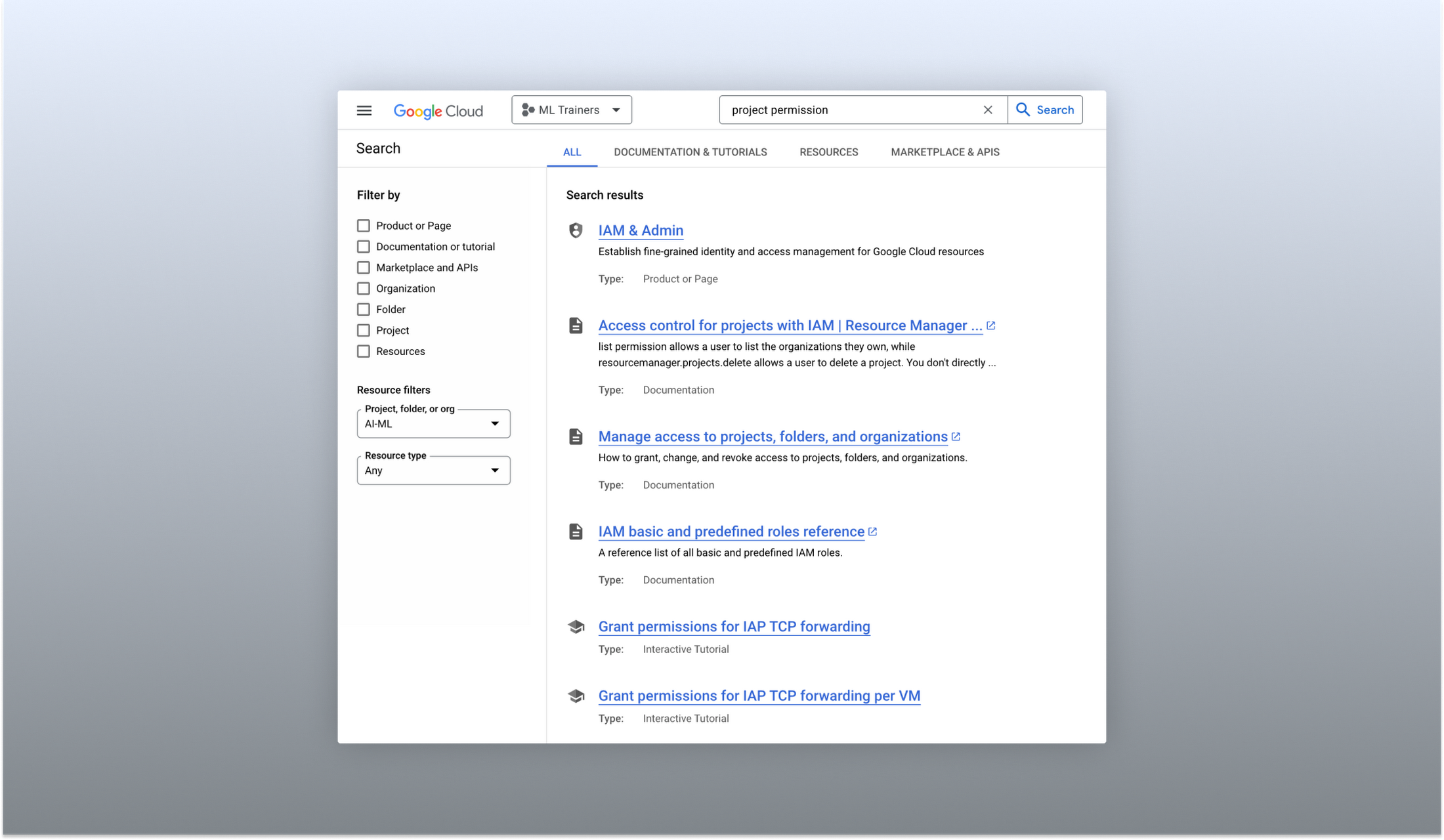

A refreshed search results page
To make browsing search results easier, we also overhauled our search results page by dividing results into tabs, similar to Google web search. This means that you can refine your search by diving into one of those categories individually. In addition to maintaining an “all results” tab, there are tabs for:
Documentation and tutorials
Resource instances, and
Marketplace and APIs
Each tab also has a better filtering experience that's unique to that search result category. For instance, the Resources tab lets you filter by metadata like the last time a resource was interacted with, while the Documentation tab allows you to search for interactive tutorials only. If you can’t find what you’re looking for in the autocomplete dropdown, try the search results page. It can provide additional results or context to help you find exactly what you’re looking for.

Accurate industry-wide synonyms
Google Cloud console search now interprets industry-wide synonyms accurately — if you're coming from AWS or Azure and know the name of a product in that ecosystem, searching for it will return the Google Cloud equivalent. A full list of synonyms can be found here.
General usability improvements
We also shipped several smaller quality-of-life improvements related to search, including:
Improvements to accessibility, including better color contrast and zoom behaviors
Faster latency targets and shorter load times for results
A search keyboard shortcut — just type “/” to begin searching without using your mouse
The ability to search for an API resource by its key
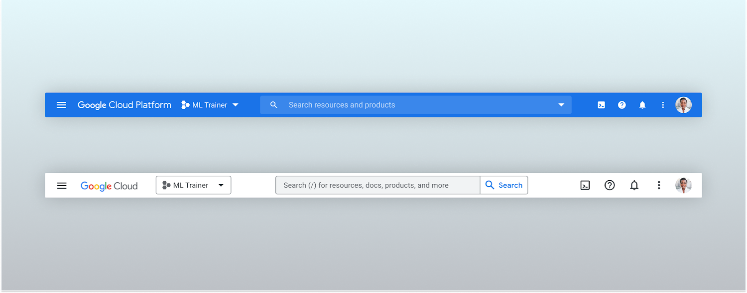
We also updated the look and feel of our platform bar to a cleaner, more modern experience that’s more in line with the branding across other Google Cloud interfaces.

A customizable navigation menu
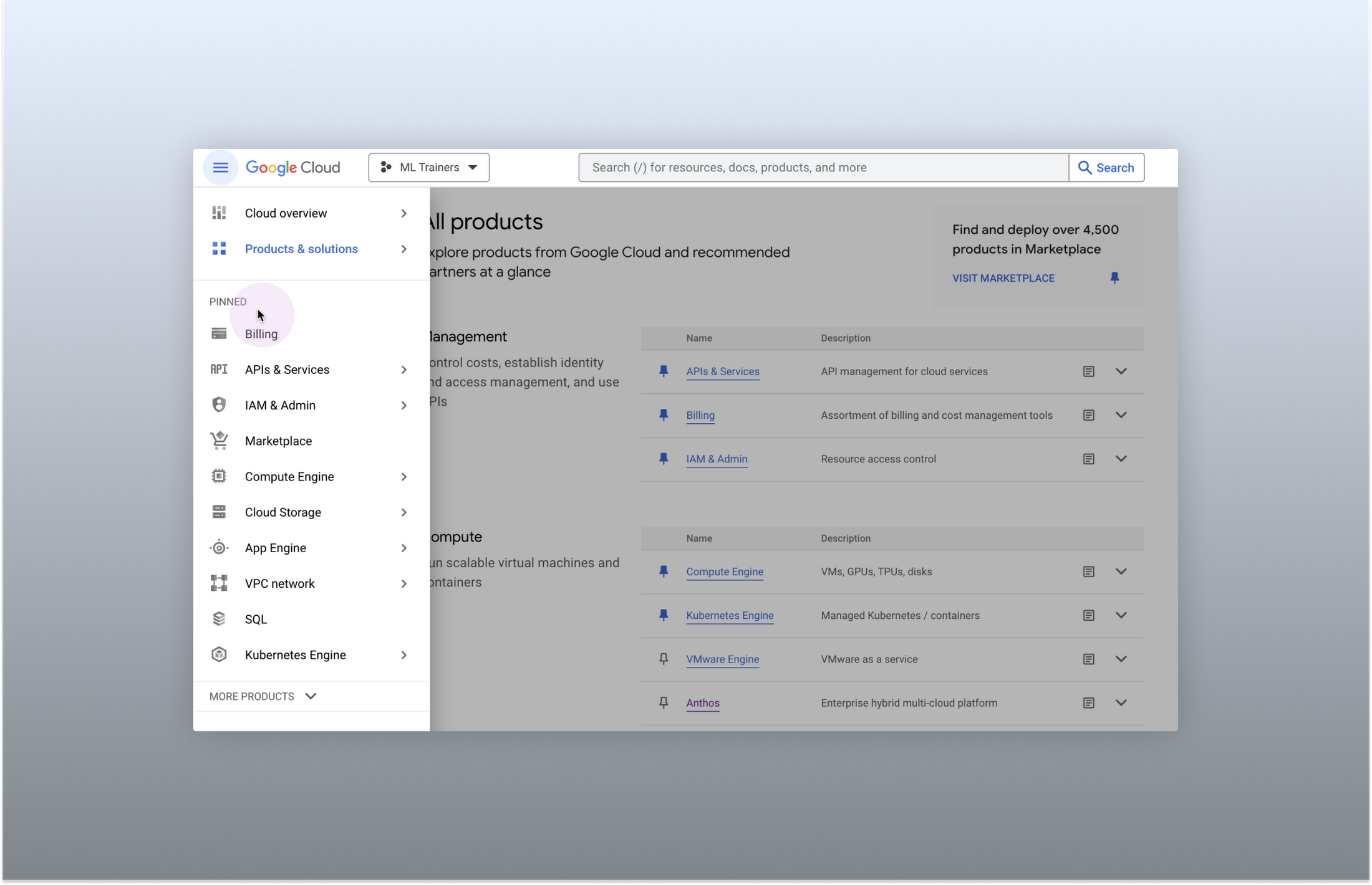
Finally, we made usability improvements to the left-hand navigation menu by allowing you to pin specific products. Products can be pinned from the left nav menu or our brand new All Product Page. This is a shift away from the default ordering of products that attempted a "one size fits all" approach to navigation. This customization feature lets you tailor the console to your specific needs and work more efficiently.

Final thoughts
The Google Cloud console's navigation and search features have come a long way. With these recent improvements, you can find what you need quickly and efficiently, making it easier to manage your cloud resources. From expanded resource-type search to improved documentation search and refined search results, the console is more user-friendly than ever before.


