Enhancing BigQuery geospatial with Earth Engine raster analytics and map visualization

Sheba Rasson
Senior Product Manager
Kel Markert
Cloud Geographer
Geospatial analytics can transform rich data into actionable insights that drive sustainable business strategy and decision making. At Google Cloud Next ‘25, we announced the preview of Earth Engine in BigQuery, an extension of BigQuery’s current geospatial offering, focused on enabling data analysts to seamlessly join their existing structured data with geospatial datasets derived from satellite imagery. Today, we’re excited to announce the general availability of Earth Engine in BigQuery and the preview of a new geospatial visualization capability in BigQuery Studio. With this new set of tools, we’re making geospatial analysis more accessible to data professionals everywhere.
Bringing Earth Engine to data analysts
Earth Engine in BigQuery makes it easy for data analysts to leverage core Earth Engine capabilities from within BigQuery. Organizations using BigQuery for data analysis can now join raster (and other data created from satellite data) with vector data in their workflows, opening up new possibilities for use cases such as assessing natural disaster risk over time, supply chain optimization, or infrastructure planning based on weather and climate risk data.
This initial release introduced two features:
-
ST_RegionStats()geography function: A new BigQuery geography function enabling data analysts to derive critical statistics (such as wildfire risk, average elevation, or probability of deforestation) from raster (pixel-based) data within defined geographic boundaries. -
Earth Engine datasets in BigQuery Sharing: A growing collection of 20 Earth Engine raster datasets available in BigQuery Sharing (formerly Analytics Hub), offering immediate utility for analyzing crucial information such as land cover, weather, and various climate risk indicators.
What’s new in Earth Engine in BigQuery
With the general availability of Earth Engine in BigQuery, users can now leverage an expanded set of features, from what was previously available in preview:
- Expanded regional deployment: Earth Engine in BigQuery now supports
EU (multi-region)andeurope-west1, in addition to US regions, for both data storage and computation, offering greater flexibility for regional needs and regulations. - Enhanced metadata visibility: A new Image Details tab in BigQuery Studio provides expanded information on raster datasets, such as band and image properties. This makes geospatial dataset exploration within BigQuery easier than ever before.
- Improved usage visibility: View slot-time used per job and set quotas for Earth Engine in BigQuery to control your consumption, allowing you to manage your costs and better align with your budgets.

New Image Detail tab in BigQuery Studio displays metadata for Aqueduct Flood Hazard dataset
A new way to visualize BigQuery geospatial data
We know visualization is crucial to understanding geospatial data and insights in operational workflows. That’s why we’ve been working on improving visualization for the expanded set of BigQuery geospatial capabilities. Today, we’re excited to introduce map visualization in BigQuery Studio, now available in preview.
You might have noticed that the “Chart” tab in the query results pane of BigQuery Studio is now called “Visualization.” Previously, this tab provided a graphical exploration of your query results. With the new Visualization tab, you’ll have all the previous functionality and a new capability to seamlessly visualize geospatial queries (containing a GEOGRAPHY data type) directly on a Google Map, allowing for:
-
Instant map views: See your query results immediately displayed on a map, transforming raw data into intuitive visual insights.
-
Interactive exploration: Inspect results, debug your queries, and iterate quickly by interacting directly with the map, accelerating your analysis workflow.
-
Customized visualization: Visually explore your query results with easy-to-use, customizable styling options, allowing you to highlight key patterns and trends effectively.
Built directly into BigQuery Studio's query results, map visualization simplifies query building and iteration, making geospatial analysis more intuitive and efficient for everyone.

Visualization tab displays a heat map of census tracts in Colorado with the highest wildfire risk using the Wildfire Risk to Community dataset
Example: Analyzing extreme precipitation events
The integration of Earth Engine in BigQuery with map visualization within a single platform creates a powerful and unified geospatial analytics platform. This allows analysts to move from data discovery to complex analysis and visualization within a single platform, significantly reducing the time to insight. For businesses, this offers powerful new capabilities for assessing climate risk directly within their existing data workflows.
Consider a scenario where an insurance provider needs to assess how hydroclimatic risk is changing across its portfolio in Germany. Using Earth Engine in BigQuery, the provider can analyze decades of climate data to identify trends and changes in extreme precipitation events.
The first step is to access the necessary climate data. Through BigQuery Sharing, you can subscribe to Earth Engine datasets directly. For this analysis, we'll use the ERA5 Land Daily Aggregates dataset (daily grid or "image" weather maps) to track historical precipitation.

BigQuery Sharing listings for Earth Engine with the ERA5 Daily Land Aggregates highlighted (left) and the dataset description with the “Subscribe” button (right)
By subscribing to the dataset, we can now query it. We use the ST_RegionStats() function to calculate statistics (like the mean or sum) for an image band over a specified geographic area. In the query below, we calculate the mean daily precipitation for a subset of counties in Germany for each day in our time range and then find the maximum value for each year:
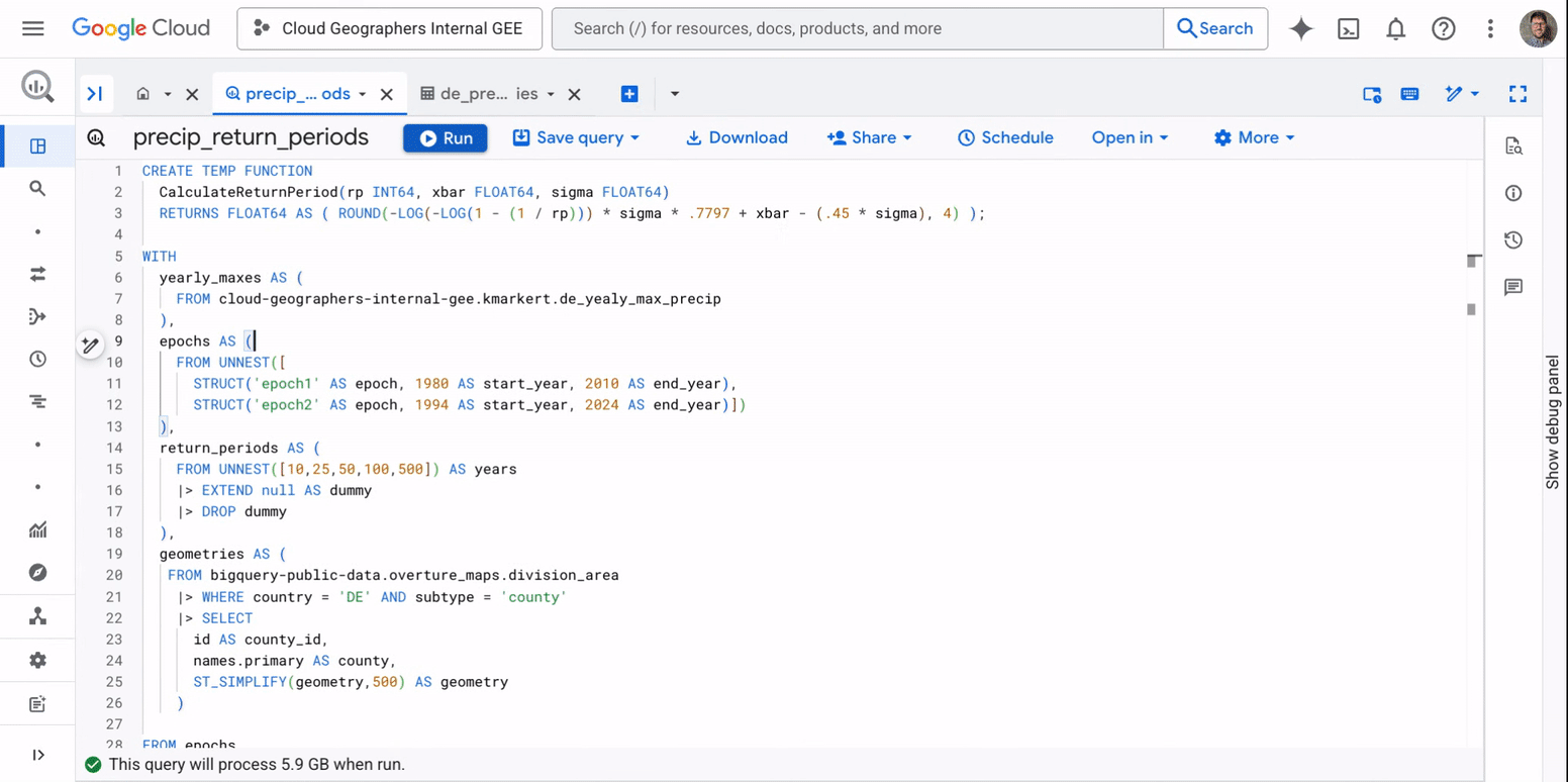
Next, we analyze the output from the first query to identify changes in extreme event frequency. To do this, we calculate return periods. A return period is a statistical estimate of how likely an event of a certain magnitude is to occur. For example, a "100-year event" is not one that happens precisely every 100 years, but rather an event so intense that it has a 1% (1/100) chance of happening in any given year. This query compares two 30-year periods (1980-2010 vs. 1994-2024) to see how the precipitation values for different return periods have changed:
Note: This query can only be run in US regions. The Overture dataset is US-only. In addition, Earth Engine datasets are rolling out to EU regions over the coming weeks.
To provide quick results as a demonstration, the example query above filters for five populated counties; running the computation for all of Germany would take much longer. When running the analysis for many more geometries (areas of interest), you can break the analysis into two parts:
-
Calculate the historical time series of maximum daily precipitation for each county in Germany from 1980-2024 and save the resulting table.
-
Use these results to calculate and compare precipitation return periods for two distinct timeframes.
With the analysis complete, the results can be immediately rendered using the new Visualization feature in BigQuery Studio. This allows the insurance provider to:
- Pinpoint high-risk zones: Visually identify clusters of counties with increasing extreme precipitation, for proactive risk mitigation and to optimize policy pricing.
- Communicate insights: Share interactive maps with stakeholders, making complex risk assessments understandable at a glance.
- Inform strategic decisions: This type of analysis is not limited to insurance. For example, a consumer packaged goods (CPG) company could use these insights to optimize warehouse and distribution center locations, situating them in areas with more stable climate conditions.
Running BigQuery analysis for changing extreme precipitation events in Germany and interactively exploring the results with the new Map visualization
This combination of Earth Engine, BigQuery, and integrated visualization helps businesses move beyond reactive measures, enabling data-driven foresight in a rapidly changing world.
The future of geospatial analysis is here
With the general availability of Earth Engine in BigQuery and the preview of map visualization, we’re helping data professionals across industries to unlock richer, more actionable insights from their geospatial data. From understanding climate risk for buildings in flood-prone areas to optimizing enterprise planning and supply chains, these tools are designed to power operational decision making, helping your business thrive in an increasingly data-driven landscape.
We are continuously working to expand the utility and accessibility of this new set of capabilities, including:
-
Growing catalog of datasets: Expect more datasets for both Earth Engine and BigQuery Sharing, allowing you to leverage analysis-ready datasets for individual or combined use with custom datasets.
-
Intelligent geospatial assistance: We envision a future where advanced AI and code generation capabilities will further streamline geospatial workflows. Stay tuned for more on this later this year!
To begin leveraging these new capabilities, explore our comprehensive documentation for Earth Engine in BigQuery and the new map visualization feature today.