The platform usage trap part 1: Why high activity doesn’t necessarily mean high value
Darren Evans
EMEA Practice Solutions Lead, Application Platform
Alex Moss
Principal Platform Engineer, John Lewis Partnership
For any organization that has invested in an internal developer platform, a question inevitably arises: Is it actually working?
Simply tracking adoption rates won't tell you if your platform is truly delivering value to your developers. This was the challenge faced by John Lewis, a major UK retailer. In our previous articles (parts 1 and 2) we introduced the John Lewis Digital Platform (JLDP) and how it enabled dozens of product teams to build high-quality software rapidly to power www.johnlewis.com and other critical applications. But how did they know that the platform was actually successful? Traditional product metrics like revenue and sales don’t translate easily to this world. When you focus only on whether your tenants use the platform, you don’t understand whether it’s bringing them value.
In this article, Alex Moss from the John Lewis platform team discusses how they moved beyond simple usage metrics to develop a sophisticated, multi-stage approach to measuring the real value of their platform — a journey that took them from lead-time metrics, to DORA, and finally to a "Technical Health" score. Along the way, they explore how the JLDP’s purpose evolved — and its value along with it. - Darren Evans
Initial measurement: A focus on platform value
In the early days of the platform, understanding its value was actually much easier. This was because the platform was created with a very clear purpose: to enable speed of change. The John Lewis business wanted to create multiple product teams working on several features of johnlewis.com in parallel, and to put those features in front of customers quickly for feedback.
Its origins in the world of the company’s John Lewis Digital online business resulted in it being treated as a product from a very early stage, and therefore integrated with that area’s reporting mechanisms too. Thus, it became normal to link the platform objectives to the online business’s broader goals each quarter and report on measurable key results. This kept the focus on the reasons the platform is important: do improvements to the platform continue to justify using it over seeking out a different one? We cannot afford to rest on our laurels!

The six annual measures reported against every quarter. The specific measures have varied over the years.
In addition to this, in the first few years of the platform’s existence, there were three simple metrics that best indicated how the platform was living up to the rationale for creating it:
-
Service Creation Lead Time: How long it took to create a tenancy (the space in which a product team was creating their software)
-
Onboarding Lead Time: How long it took that product team to deploy something into production
- First Customer Lead Time: How long it took that product team to designate their service as “live to customers”
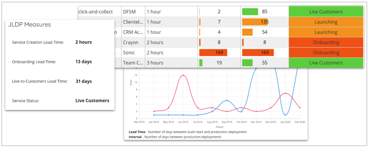
Some screenshots from the early version of the platform's self-written service catalogue, tracking the three metrics mentioned
This was then combined with the number of tenants present on the platform into a report, which was displayed as part of an initial home-grown Service Catalogue shown above (which was later replaced with Backstage). This report served two purposes:
-
A very clear visualization for stakeholders of how much their platform was being adopted, and how fast they were able to get up and running (in particular, “Service Creation” being measured in single-digit hours, in comparison to the weeks teams would traditionally have had to wait). This is important, because in the early days of your product, you need to justify its continued growth and investment.
-
A useful way for the platform team themselves (and stakeholders) to see which teams were taking their time about getting something into production. Is my product actually helping you? And if not, what more could we be doing?
Using this as a conversation-starter with our tenants opened doors to rich sources of feedback that could be turned into platform features: When we asked tenants “What’s stopping you from going live?”, they often answered that the product they were building was simply complex. But we also often saw that our own processes were getting in the way. This was important, as we could then do something about it.
The easiest of these barriers for us to overcome were typically technology-related. In previous articles, we covered two examples, “My team is spending a lot of time writing Terraform to provision PubSub,” and “we’re having trouble learning how to use Kubernetes.” To help, the platform team created “paved roads” to enable self-service provisioning or simplification of Kubernetes, significantly reducing these burdens for teams.
The more significant opportunities to streamline getting new services live were a result of our processes (e.g., security approvals) — and if your platform is empowered to simplify these sorts of organizational functions, then the gains can be extremely beneficial. One such example was the Information Security risk assurance process. Gaining the necessary security sign-offs and producing the required documentation was a necessary but time-consuming task, and - with the rate of change in the business - this was often something that many teams were going through in parallel. Our platform team successfully negotiated a simplified process for its tenants. It was able to do this because, by being resident on the platform, they could guarantee that security controls were in place and that policies were being followed. This was a direct result of the platform building features to meet those needs, and being able to provide evidence that they were being used — removing the need for the tenant team to either document or invent this themselves. This is still simplifying the developer experience through platform engineering, even though the solution is a less technically-based one.
Sometimes the conversation resulted in feedback that wasn’t even platform-shaped — for example, helping teams understand concepts like feature flagging and dark launching, or software design options to help break dependencies with legacy systems. John Lewis’ platform teams are staffed with experienced engineers, ideally ones with software development experience, which helps a lot with these sorts of interactions.
A key point here is that by measuring how effectively teams were making it into production, we could identify who to talk to and elucidate the feedback we needed on what problems needed to be addressed. Simply relying on your tenants thinking of this themselves when they don’t see the bigger picture (or have other priorities) is not nearly as effective.
We then combined the process with more traditional approaches such as sending out a survey or use of Net Promoter Scoring to help build popularity in the product. The results of these were usually very positive, and could be used to generate mindshare — especially where a product team was comfortable talking about their positive experiences in internal tech conferences and the like.
Helping understand team performance
A few years into the life of the platform, our emphasis started to shift. There was less of a need to prove the value of the platform — the business and our engineers were happy — so we shifted from “how can we get you into production as quickly as possible” towards “how can we enable you to continue to be as fast, but also reduce friction, in your day-to-day activities.” This led us towards DORA metrics.
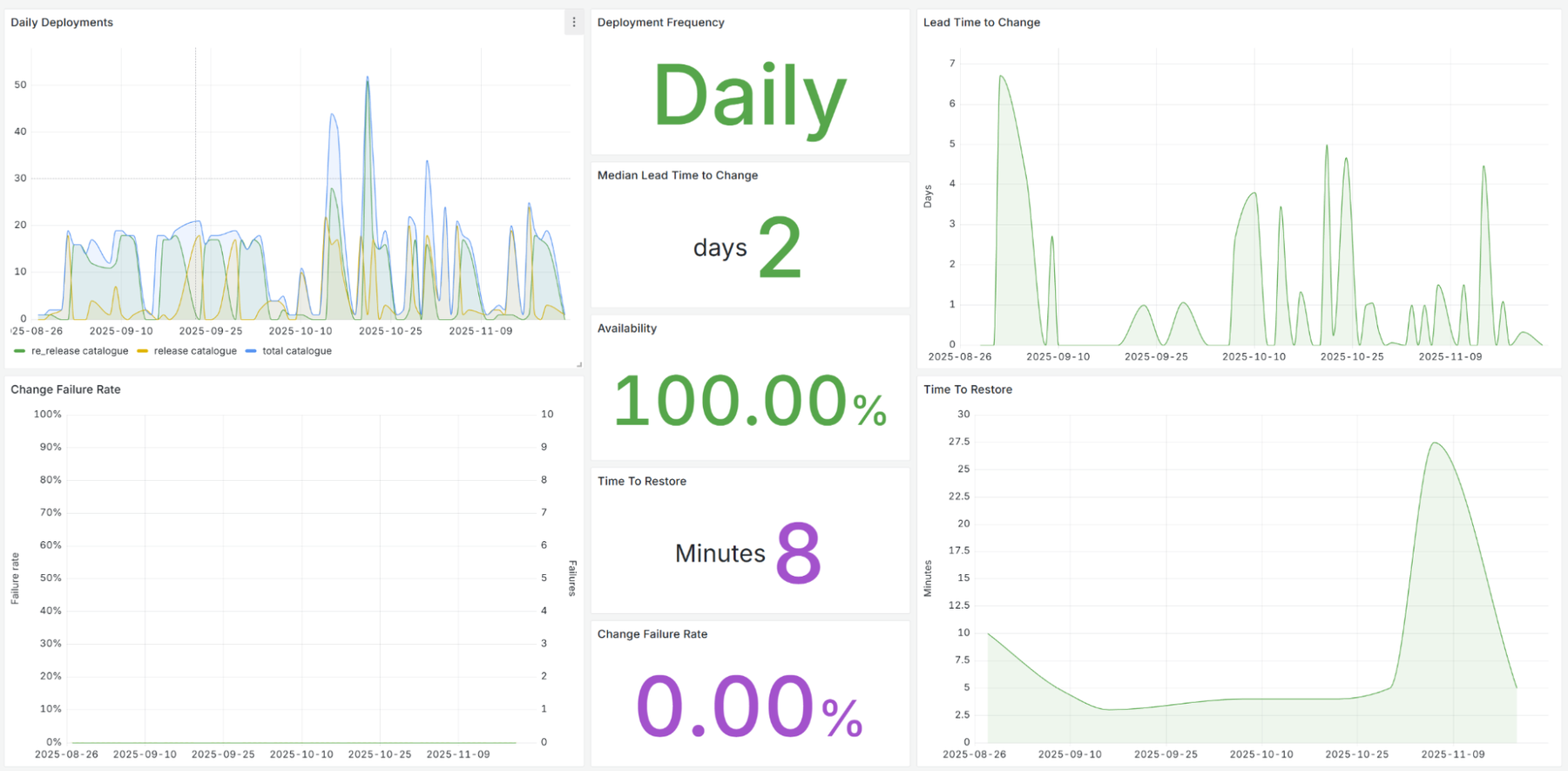
Our initial DORA implementations involved mining information from our systems of record for change and incident, complimented by our already-mature observability stack for availability data, as well as pulling events from things like cloud audit logs. We built software to do this and stored it in BigQuery, which enabled us to visualize the data in our home-grown Service Catalogue tool. Later, we moved this into Grafana dashboards instead, which are still in use today:
Looking for patterns in this data led to us discovering additional features that would be useful for us to build. Two major examples of this were handling change, and operational readiness.
JLP’s service management processes were geared towards handling complex release processes across multiple large systems and/or teams - but we had fundamentally changed our architecture by adopting microservices. This empowered teams to release independently at will, and therefore manage the consequences of failed changes themselves. We used the data we’d collected about change failure rates and frequency of small releases to justify a different approach: allowing tenants to automatically raise and close changes as part of their CI/CD pipelines. After clearing this approach with our Service Management team, we developed a CLI tool that teams could use within their pipelines. This had the additional benefit of allowing us to capture useful data at point of release, rather than scraping more awkward data sources. The automated change “carrot” was very popular and was widely adopted, shifting the approval point left to the pull request rather than later in the release process. This reduced time wastage, change-set size and risk of collisions.
In a similar vein, with more teams operating their own services, the need for a central site-wide operations team was reduced. We could see from our metrics that teams practicing “You Build It, You Run It” had fewer incidents and were resolving them much more quickly. We used this as evidence to bring in tooling to help them respond to incidents faster, and decouple the centralized ops teams from those processes — in some cases allowing them to focus on legacy systems, and in others, removing the need for the service entirely (which resulted in significant cost savings, despite the fact that we had more individual product teams on-call). This, and supporting observability and alerting tooling, was all configured through the platform’s paved-road pipeline described in our previous article.
The DORA metrics helped us architecturally as well. Operational data shined a light on the brittleness of third-party and legacy services, thereby driving greater investment into resilience engineering, alternative solutions, and in some cases, causing us to re-evaluate our build vs. buy decisions.
Choosing what to measure
It’s very important to choose wisely about what to measure. Experts in the field (such as Laura Tacho) influenced us to avoid vanity metrics and to be cautious about interpreting the ones we do collect. It’s also important for metrics to be meaningful to the target audience, and presented accordingly.
As an example, we communicate about cost and vulnerability with our teams, but the form this takes depends on the intended audience’s role. For example, we send new vulnerabilities or spikes in cost directly to product teams’ collaboration channels, because experience has taught us that having our engineers see these vulnerabilities results in a faster response. On the other hand, for compliance reporting or review by team leads, reports are more effective at summarising the areas that need action. Because if we know one thing, it’s that nobody wants to be a leader of the “vulnerabilities outside of policy” dashboard!
It was not unusual for us to historically look at measures such as the number or frequency of incidents. But in a world of highly automated response systems, this is a trap, as alerts can be easily duplicated. Focusing too much on a number can drive the wrong behavior — at worst, deliberately avoiding creating an incident at all! Instead, it’s much better to focus on the impact of the parent incident and how long it took to recover. Another example is reporting on the number of vulnerabilities. Imagine you have a package that is used extensively across many components in a distributed system. Disclosing that the package has a vulnerability can create a false sense of scale, when in fact patching the base image deals with the problem swiftly. Instead, it’s better to look at the speed of response than a pre-agreed policy based on severity. This is both a much more effective and reasonable metric for teams to act on, so we see better engagement.
It’s very important that you put across as much context as possible when presenting the data so that the right conclusions can be drawn — especially where those reports are seen by decision-makers. With that in mind, we combined raw metrics we could visualize with user opinion about them. This helped to bring that missing context: Is the team that’s suffering from a high change failure rate also struggling with its release processes and batch size? Is the team that’s not addressing vulnerabilities quickly also reporting that they’re spending too much time on feature development and not enough on operational matters? We reached for a different tool — DX — to help us bring this sort of information to bear. In our follow-up article, we’ll elaborate on how we did this and how it prompted us to expand the data we collected about our tenants. Stay tuned!
To learn more about shifting down with platform engineering on Google Cloud, start here.