This page shows examples of patterns that you might see in a Key Visualizer heat map. These patterns can help you to troubleshoot specific performance issues.
Some issues that are exposed in Key Visualizer relate to your primary key definition. Because a primary key is immutable, these issues are best discovered during the design, or proof of concept, stage.
Other issues may relate to your instance's node allocation. You may need to provision additional capacity, either overall or possibly at certain times of day. To change the number of nodes associated with your instance, see Changing the number of nodes.
- To learn how to open a Key Visualizer scan, see Viewing the scan for a time period.
- To find out how to explore a Key Visualizer scan in detail, see Exploring Heatmaps.
Before you read this page, you should be familiar with the overview of Key Visualizer.
Evenly distributed reads and writes
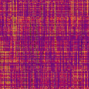
If a heatmap shows a fine-grained mix of dark and bright colors, then reads and writes are evenly distributed throughout the database. This heatmap represents an effective usage pattern for Spanner, so you do not need to take any action.
Your own heatmap may not be as evenly distributed as this but still illustrate a healthy schema and workload. Some number of hotspots can be expected in a properly resourced configuration.
Monotonically increasing keys

A heatmap with a single bright diagonal line, or a triangle with a flat top, can indicate a database that uses sequential keys. Sequential keys are an anti-pattern in Spanner; see the Schema design best practices page for why sequential keys cause hotspots.
Persistently hot key ranges
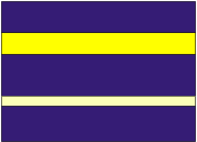
If a heatmap shows horizontal bands of bright color, separated by dark colors, it indicates that specific row ranges are consistently being more heavily accessed over time.
To address this issue, consider changing your schema design or your application so that the data in a heavily used row, or in an excessively large row, is spread across multiple rows.
Single hot table

If a heatmap shows a band of bright color in a single table, it indicates heavy access of that table over time.
This pattern by itself is not necessarily problematic. If you're seeing this pattern in combination with performance issues, you're likely running out of compute capacity. Some things to consider:
Your application may be requesting a full table scan, which will show in Key Visualizer as a bright band of the whole table. Instead, consider a more restrictive query, or query against the index to reduce the number of rows being scanned.
Increase the number of nodes for this instance.
Roving reads and writes over times

A heatmap showing multiple diagonal bright lines (rising or falling) usually indicates sequential reads or writes to rows in a short period of time.
If the lines correspond with read activity, such as a table export, no action is required. If you're experiencing performance issues during these reads, consider increasing the number of nodes for your instance during these time periods. You can decrease the node number between periods.
If the lines correspond with write activity, and you're experiencing performance issues, you should consider changing your workload to a random write instead of a sequential write.
Sudden traffic increase

A heatmap showing bright horizontal bands that appear partway across the heatmap indicate a sudden change in the usage pattern of a database. This can be a rogue query or an unexpected surge in activity for certain rows.
Caveats
There are some scenarios where Key Visualizer may not present a complete picture of performance and resource usage.
| Scenario | What the heatmap shows |
|---|---|
| A large data table and a few small tables | Key visualizer selects more row ranges in large tables than smaller tables. As a result, a small table may only appear as a single row range on the heatmap. There will be a row range representing every table as long as the number of tables is less than 1,000. When a key or a small range of keys are hot in a small table, the user may only know that this table is hot, but not any further. |
| Many tables / indexes For example, a database with hundreds or over a thousand tables, regardless of size. |
Key visualizer selects at most 1,000 row ranges. When there are many tables and indexes, some of them may only have zero or one data point on the heatmap. Therefore, hotspots may be missing due to its table being skipped or downsampled. |
| Rapidly changing keys | Rapid changes in the key space will result in frequent changes in row ranges. When a previous row range has to be split, due to newly inserted keys, or multiple row ranges are merged, due to deleted keys, the metrics will be approximated (e.g. divided/combined). Compounded approximation of metrics values will likely make them less accurate. In addition, there is a delay in updating row ranges after changes in the key space, which can result in a loss of granularity until row ranges are updated. |
What's next
- Learn how to get started with Key Visualizer.
- Find out how to explore a heatmap in detail.
- Read about the metrics you can view in a heatmap.