The Anthos Service Mesh pages in the Google Cloud console provide both summary and in-depth metrics, charts, and graphs that enable you to observe service behavior. You can monitor the overall health of your services, or drill down on a specific service to set a service level objective (SLO) or troubleshoot an issue.
Viewing summary SLO and service status
The Anthos Service Mesh page is your point of entry. Near the top of the page, a summary of your alerts and SLOs are displayed.

Below the SLO status section is a summary view of the health of your services in the service mesh:
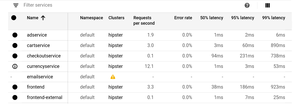
The icons next to each service name indicate the SLO status of the service. To monitor or view details for a specific service, click the service name. You can apply filters to control which services are displayed in the table:
- Click a Filter by link in the SLO status section to display only the applicable services in the table. For example, you can filter the table to show only the services that don't have an SLO set.
- Click filter_list Filter services in the top-left corner of the table to apply additional conditions.
In the upper-right corner of the window are the following controls:
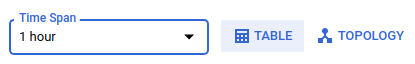
- Click the Time Span drop-down list to display the status information for a specific time period.
- Click Topology to display the service graph.
- Click Table to switch back to the table view.
Exploring the service graph
You can explore a service topology graph visualization that shows:
- Your mesh's services.
- The Kubernetes workloads that back those services.
- The relationships between the services.
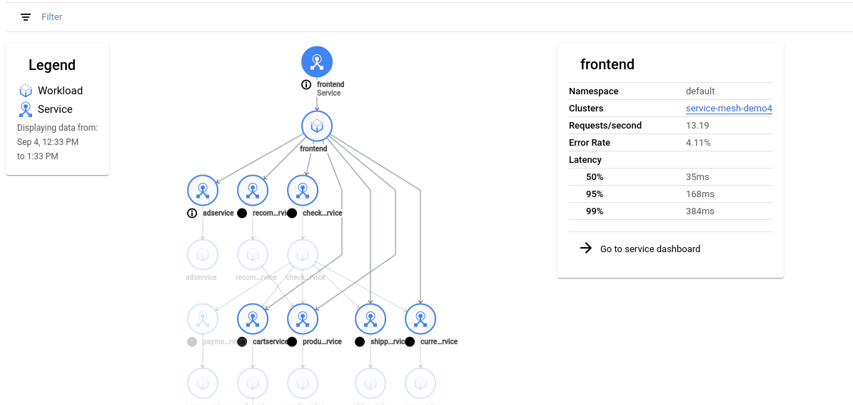
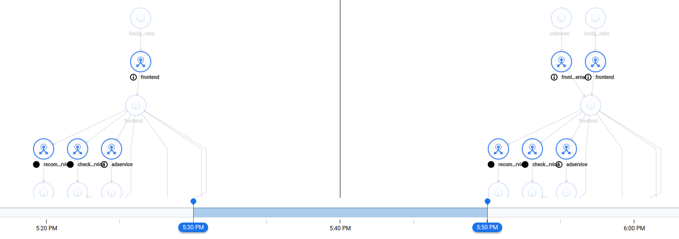
In the screenshot below, the frontend service is backed by a single frontend Kubernetes workload. The workload in turn, sends requests to several other services. The icons beside each service are the same SLO status icons that are displayed in the table view.
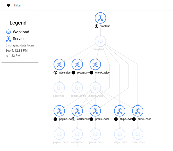
When you click on a service icon, a card appears with details about the service, including some key metrics. The card also includes a link to the Overview page for that particular service.
There are several ways you can interact with the graph:
- To pan across the graph, click and drag in the background.
- To zoom the graph, use the mouse wheel.
- To reposition services or workloads in the graph for easier viewing, click and drag the graph node.
You can expand a workload to its underlying components by holding the pointer over a workload icon and clicking the plus sign that appears in the upper-right of the icon. By clicking the plus sign a few more times, you can drill down from workload to deployment, replica set, Pod, and even container.
As the services and their communication patterns change over time, the service graph tracks these changes. You can use the timeline at the bottom of the page to define a point in time to view the state of the graph. The Legend displays the time interval for the graph.
Communication relationships are based on observed network traffic. If services don't communicate at the specified time, then no edge exists between those services.
Above the timeline on the right side is the Enable time diff comparison
icon: ![]()
When you click this icon, the graph enters diff mode, which lets you compare
the graph at two points in time.
In diff mode, you can switch between different visualizations using the icons:
![]()
The timeline at the bottom of the window controls the two points in time that you are comparing. You can adjust the two sliders to change the time period.
Monitoring a specific service
On the Services Mesh page, you can select a service to monitor from either the table or topology view. After you select a service, a left-navigation bar appears with links to the following pages:
The Overview page displays SLO status, key metrics, and details about the service.
The Health page displays SLO details.
The Metrics page displays charts for key traffic and infrastructure metrics. You can break down the metrics in numerous ways, such as by cluster and Pod.
The Connected services page displays details about inbound and outbound requests.
The Diagnostics page displays error logs.
The Infrastructure page displays key metrics and details about each Pod. You can click the Pod name to go to the Workloads page in the Google Cloud console.
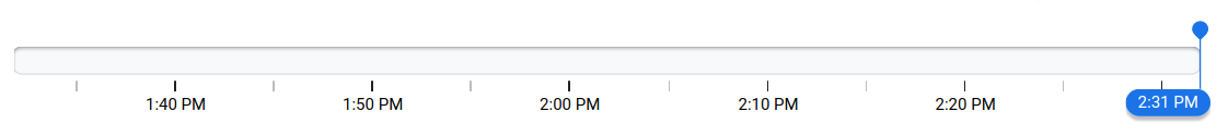
Working with the timeline
At the top of each page for a specific service, you can click the Time Span drop-down list to display information for a specific time period.

To specify a custom time, click access_time Show Timeline.
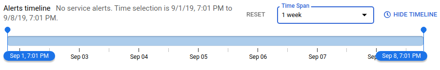
You can use the timeline to refine the time interval that is applied to the page. The total time span displayed by the timeline is controlled by the Time Span drop-down list. When you select a new time span, the timeline and other elements on the page update to reflect that time span. For example, the graphs on the Metrics page show data corresponding to your chosen time span. To refine the time span even more, drag the blue sliders.

Accessing Cloud Logging
The Anthos Service Mesh pages provide the following links to Cloud Logging:
On the Metrics page, under the filter_list Select a filter link, click the View traffic logs link to view all logs for the service during the specified time span.
On the Diagnostics page, in the upper-right corner of the window, click the Open in logging link to view error logs during the specified time span.
What's next
- Control access to Anthos Service Mesh in the Google Cloud console
- Learn about service level objectives