Map charts let you visualize geographic data on responsive and interactive maps, and provide significant control over the way that map points are plotted.
Building an interactive map chart
To create a map chart, your query must include at least one of the following fields:
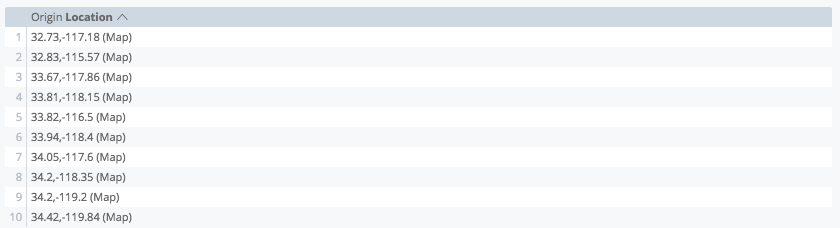
- A dimension based on latitude and longitude data. This is defined by a LookML developer as a dimension of
type: location. - A dimension with a map layer assigned to it. LookML developers can add a built-in map layer or a custom map layer to a dimension using the
map_layer_nameparameter. - A ZIP Code dimension. ZIP Code regions are based on the 2010 ZIP Code tabulation areas (ZCTAs). There may not be a one-to-one correspondence between ZIP Codes and the ZCTAs used for map visualizations. It is possible that not all points will be visualized in the map.
Limit the precision of latitude and longitude data coordinates to no more than five to six decimal places. If coordinates exceed seven decimal places, then the map will not display any data points.
To build an interactive map chart, select the Map visualization type in the Visualization bar. You can also edit your map visualization in the visualization menu. Click the gear in the upper right corner of the Visualization bar.
Options listed below may be grayed out or hidden if they conflict with other settings that you have chosen.
Plot menu options
The Plot tab lets you select the way that your location data is plotted. Each choice has slightly different formatting options, as appropriate for the plot type. Plot options also differ depending on whether a map layer is defined in the LookML for your dimension. Note that for ZIP Code dimensions, Looker automatically assigns a US ZIP Code map layer.
|
For dimensions that are not associated with a map layer, Looker displays the following Plot options: |
For dimensions that are defined with a map layer, Looker displays the following Plot options: |
Points
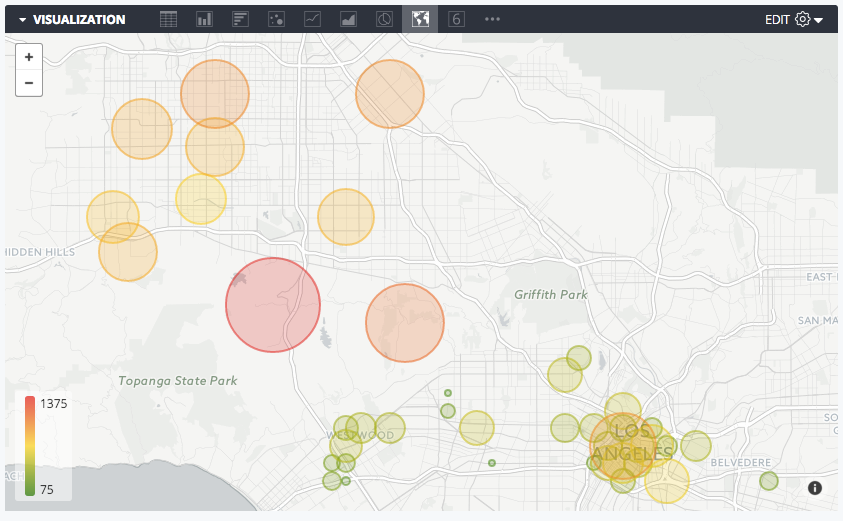
You can plot each row in an underlying data table as a discrete point on the map.
Plotting a location dimension by itself will place points of uniform size and color. Adding a measure to the underlying data table enables the points to be scaled by color or size.
Automagic Heatmap
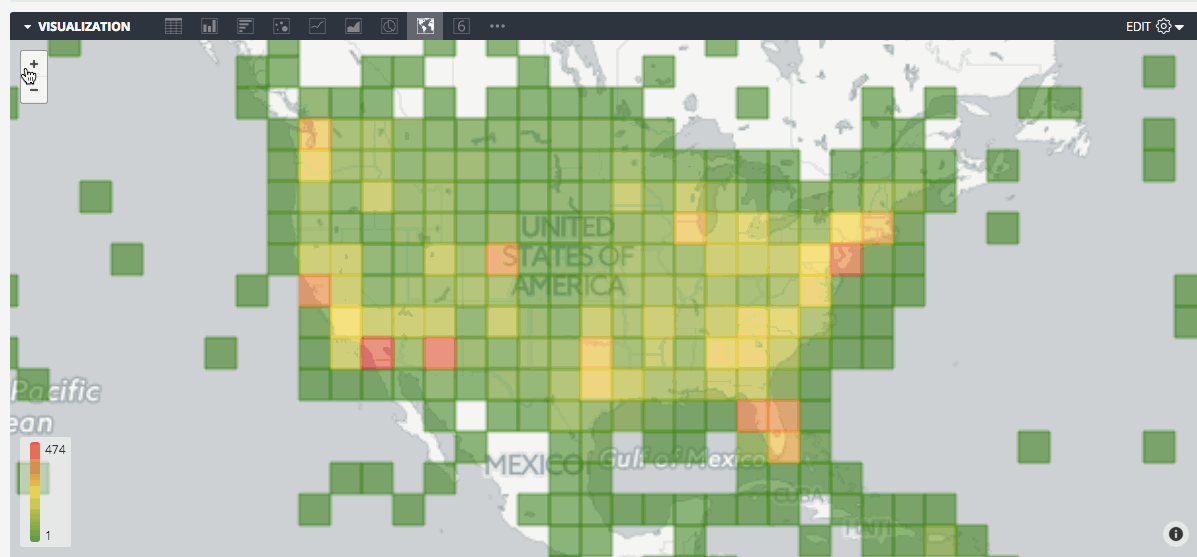
You can display data in the underlying query as a heatmap grid. It works by dividing the visible map into equal squares, then calculating which values in your data fit into each square. The squares are colored according to a measure that you choose. Zooming this map in or out will prompt Looker to re-calculate the grid, so that the granularity is appropriate to the zoom level.
For this plot type to work properly, you must select both a location dimension and a measure.
The Automagic Heatmap will re-query your data to construct the heatmap grid. A location dimension will typically show distinct points with one latitude/longitude coordinate, but when you use a heatmap, the dimension changes to the bounding boxes ("Heatmap region from ... to ..") of each square in the grid.
Connect with Lines
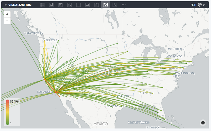

The Connect with Lines map visualization takes two fields of type:location from your query, then connects them together in the visualization. Adding a measure to the query lets you add a color scale to the lines.
Connect with Areas
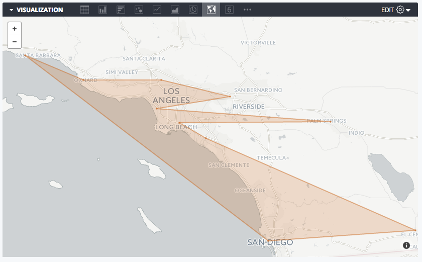
The Connect with Areas map visualization takes one field of type:location and connects all the points in the order that you've sorted them, forming the boundaries of an area on the map. Adding a measure to the query lets you format the size and color of the individual location points bounding the area.
Heatmap Gridlines
For heatmap visualizations, you can add a border around each of the gridlines used for the heatmap.
Heatmap Opacity
For heatmap visualizations, you can specify the opacity of the colors used in the heatmap. Enter a number between 0 and 1, where 0 means no color and 1 means totally opaque.
Gridlines on Empty Regions
If the Heatmap Gridlines option is turned on, and you are plotting a dimension that has a defined map_layer_name, you can enable the Gridlines on Empty Regions toggle to display an outline around the map regions that have no associated data.
![]()
Map menu options
Map Style
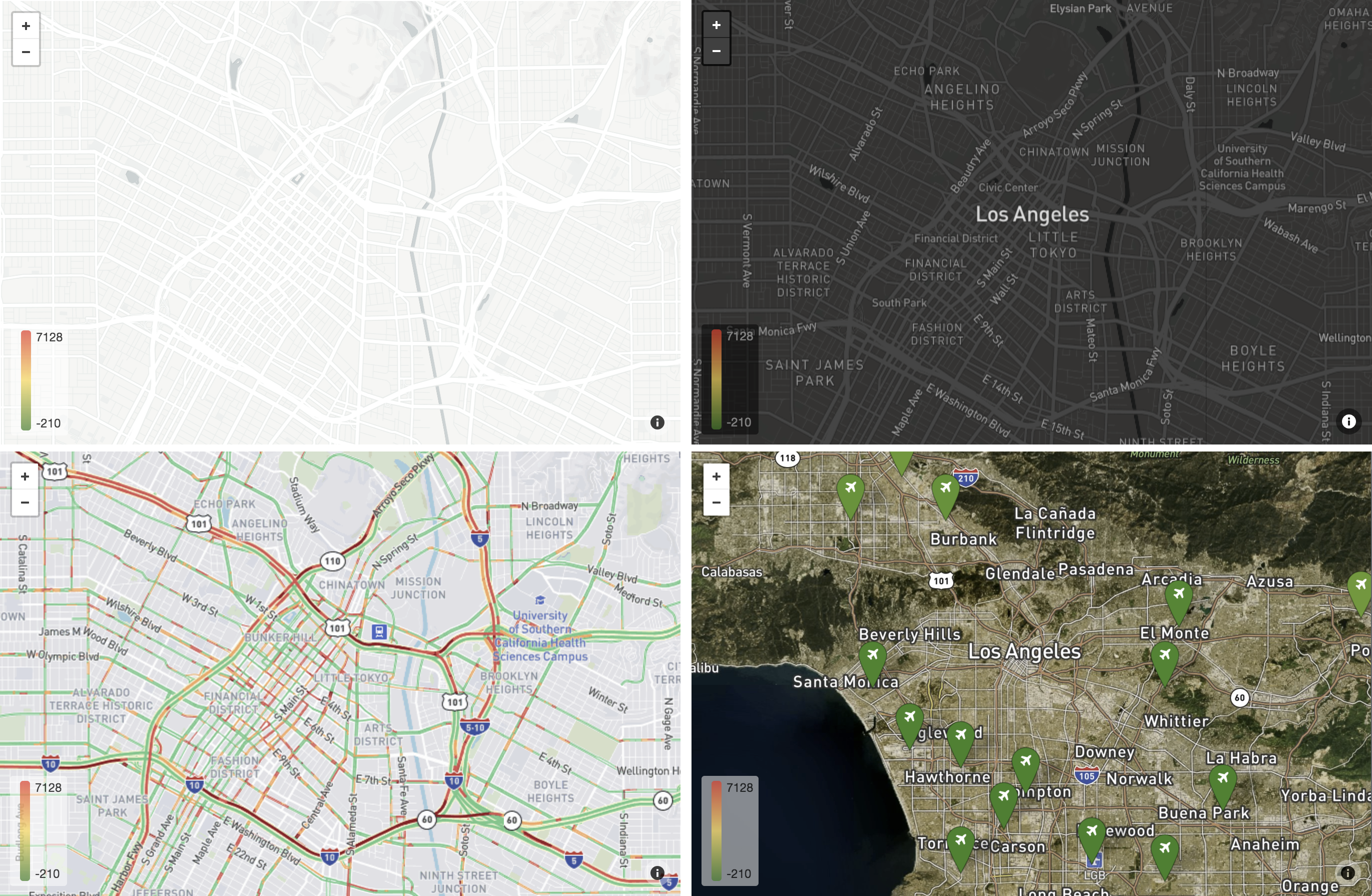 Map styles clockwise from top left: Light (No Labels), Dark, Satellite, Traffic (Day)
Map Style lets users change the type of background map, and whether map labels (like cities and streets) should be displayed. This option features a drop-down menu with a list of choices:
- Light: Subtle, light-colored map designed to provide geographic context while highlighting your data.
- Light (No Labels): Same as Light, except the map omits labels such as city names.
- Dark: Subtle, dark-colored map designed to provide geographic context while highlighting your data.
- Dark (No Labels): Same as Dark, except the map omits labels such as city names.
- Satellite: Map displaying global satellite and aerial imagery.
- Satellite (No Labels): Same as Satellite, except the map omits labels such as city names.
- Streets: General-purpose map that emphasizes legible styling of road and transit networks.
- Outdoors: General-purpose map tailored to hiking, biking, and other outdoor uses.
- Traffic (Day): Light-colored map emphasizing transit networks and roads, including current traffic information.
- Traffic (Night): Dark-colored map emphasizing transit networks and roads, including current traffic information.
Map Position
You can change the center point and zoom level of a visible map:
- Fit to Data: Automatically centers and zooms the map such that all the data points of your query are visible.
Custom: Lets you manually set a Latitude, Longitude, and Zoom Level (higher numbers create a closer zoom level):
If you drag and zoom the map itself to arrive at the view you'd like, these values are automatically filled in when you choose Custom.
This option is unavailable when the Automagic Heatmap plot type is selected.
Map Scale Indicator
You can enable a map scale and set the units that the scale uses by choosing from the following options:
- Off
- Metric (m, km)
- Imperial (ft, mi)
- Metric and Imperial
Allow Panning
You can determine whether users can reposition the map by dragging it. This feature is allowed by default.
Allow Zooming
You can decide if a (+/-) button should display in the upper left of the map visualization, allowing users to zoom in and out. This feature is on by default.
Show Full Field Name
You can determine whether to show the view name along with the field name in map tooltips, which display when users click on map data points.
Show Legend
You can determine whether a map legend displays in the lower right of a visualization. The legend shows the color scale that you are using, if you've added a measure to your visualization.
The Show Legend option is available for the following Plot options:
- Automagic Heatmap mode
- Points mode, when Marker Color Mode is set to Based on Value
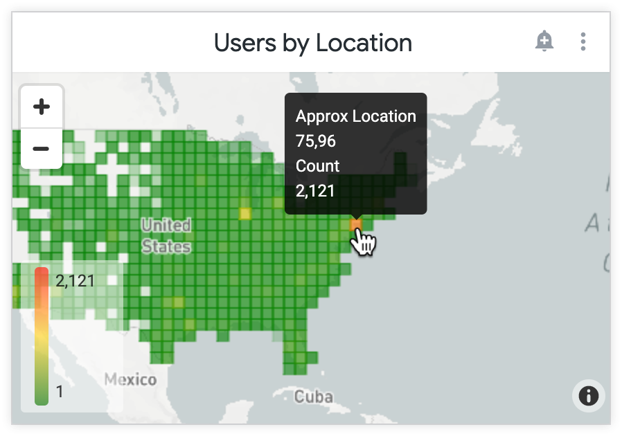
Show Region Field in Tooltip
When this feature is enabled, the region name is included in the tooltip of the map. By default, the tooltip includes only the measure values. To see the tooltip, click on a region or point on the map visualization.
If your Looker developer has defined drilling options for the dimension, you can click the region name to drill further into the data.
Tooltips on map charts look and function slightly differently when viewed on dashboards. For more information, see the Viewing map charts in dashboards section on this page.
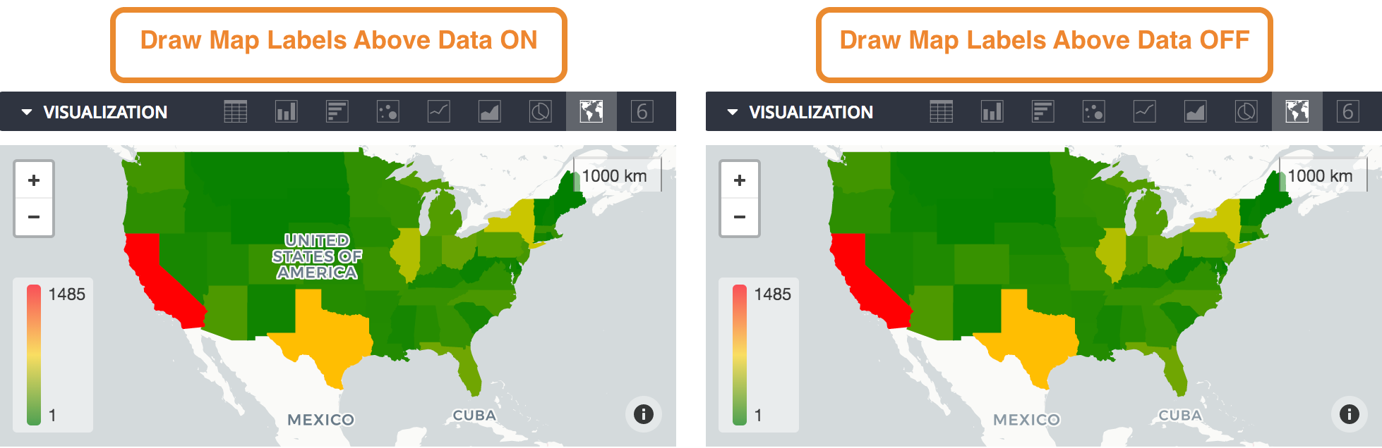
Draw Map Labels Above Data
When this feature is enabled, the map labels, such as region names, appear on top of the heatmap.
This feature is recommended with higher heatmap opacity values. If your heatmap is opaque, and this feature is disabled, the map labels will be obscured by the heatmap colors.
Points menu options
These options are unavailable when the Automagic Heatmap plot type is selected.
Type
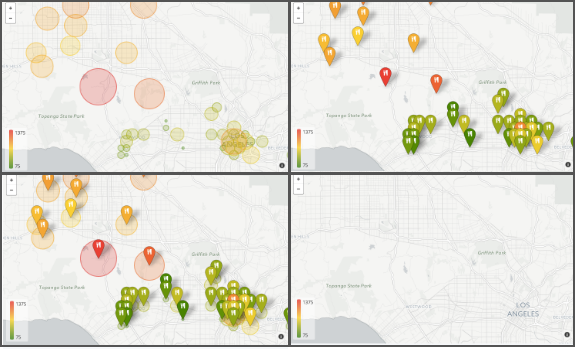
Point types clockwise from top left: Circle, Icon, None, Both
For maps of plot type Points, Lines, and Area, Type specifies the type of point displayed on the map visualization:
- Circle
- Icon
- Both
- None
Icon
You can choose an icon to display on all map markers in the visualization.
The icon choices include the following:
- Airplane
- Car
- House
- Person
- Restaurant
- Tree
Radius
If you used a Type of Circle, you can set the size of that circle:
Proportional to Value: Adjusts the relative size of the circles according to measures you've added to your query. When you choose this option you can set a Minimum Radius and Maximum Radius of the circles, which will correspond with the lowest and highest value in your data. You can also toggle between a Linear and Logarithmic scale when the circles are being sized.
Equal to Value: Adjusts the radius of the circles to the actual measure values in your underyling query. This likely only makes sense if you are plotting distance data — for example, if your measure contained the size of a territory.
Fixed: Lets you set a fixed radius to apply to all map markers. The default value is 500.
Radius Units
You can set the units that are used in the Radius section to meters or pixels.
Marker Color Value
You can set the color of the map markers in an interactive map:
- Based on Value: Colors are dynamically assigned to markers based on the values of your underlying query. To configure the colors in the legend for this option, see the Value Colors option.
- Custom: Lets you set a single color to use for all map markers. The color value can also be formatted as an RGB hex string, such as
#2ca6cd, or as CSS color names, such asmediumblue.
Value menu options
Value Colors
You can set the color of map points or define the range of colors to be used if you are color coding according to a measure.
You can input a list of hex strings, such as #2ca6cd, or CSS color names, such as mediumblue. The colors you input first are associated with the lowest values.
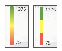
Quantize Colors
When turned on, Quantize Colors changes the color scale from a smooth gradient to only the specific colors you've set.
The image on the left depicts the legend when Quantize Colors is off, and the image on the right depicts the legend when Quantize Colors is turned on:
Reverse Color Scale
When turned on, Reverse Color Scale switches the colors that indicate high and low values on the chart, reversing the color gradient.
Minimum Value/Maximum Value
You can set the minimum and maximum values of the color range. This lets you color code all points below a certain threshold with the lowest color and all points above a certain threshold with the highest color.
By default this field is left blank, and the minimum and maximum values applied on the legend are the minimum and maximum values from your query.
Viewing map charts in dashboards
When you view map charts in dashboards, tooltips function slightly differently than they do when you view map charts as Looks or as Explores.
In dashboards, the tooltips appear on hover, rather than on click. Viewers of a dashboard can see content placed in a tooltip with the html parameter, but if any interactive content is included as part of the html parameter — such as links — viewers cannot click on it.
If you click Explore from Here on a map chart dashboard tile, or if you open the edit window for a map chart tile, you will see the Look and Explore version of the map chart.