Tell compelling stories with your data using Google Sheets
Dan Gundrum
Product Manager, G Suite
Try Google Workspace at No Cost
Get a business email, all the storage you need, video conferencing, and more.
SIGN UPA picture is worth a thousand words--especially at work. The data we present everyday is what helps us drive decision-making in the workplace. But understanding how to visualize a story can be difficult if you’re left staring at numbers sitting stagnant in rows or columns within a spreadsheet.
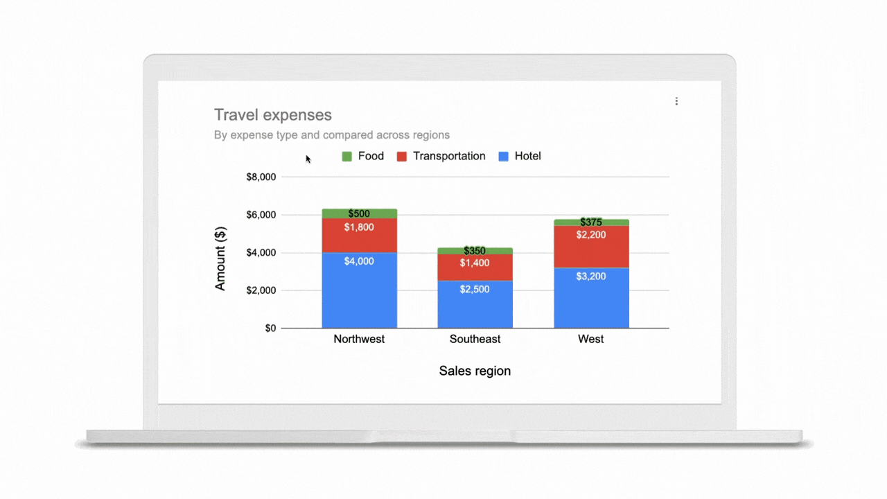
This is where visualization with charts and reports becomes critical. Let’s say your team needs to understand global sales trends. If you have a waterfall chart that shows regional contribution to total revenue or a scatter plot that shows individual salesperson performance, it’s much easier to spot patterns, draw insights, and make informed recommendations. The same goes for analyzing travel expenses.
In Google Sheets, we have several built-in tools that make it easy to create and share useful charts and reports so that you can quickly visualize data (without having to leave the spreadsheet). Follow these tips to showcase your data in Sheets and influence decisions.
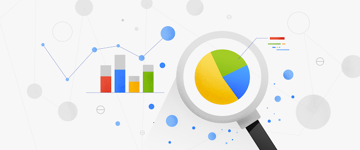
1. Pick the most compelling way to visualize your data.
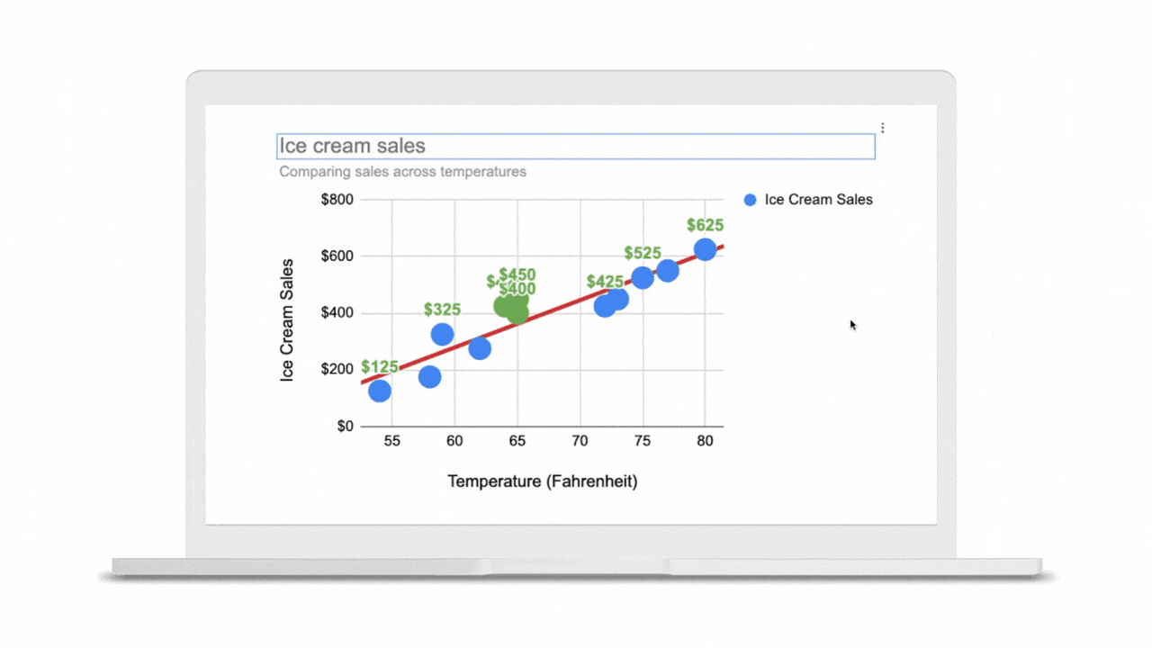
Perhaps just as important as the data you reference is the way in which you present it. Charts are the basic building blocks for data visualization and can take many forms--from bar charts to line graphs to scatter plots. There are more than 30 chart types to choose from in Sheets, and we’re constantly adding more ways to express your data. Here are a few we recommend:
To draw attention to a key metric or KPI, try the brand new scorecard chart. For example, you can show the total sales number for your organization’s top selling product, and even call out percentage increase or decrease over time.
To illustrate how values add to or subtract from a starting value, try a waterfall chart. For example, show how your product sales and restocking efforts led to a net decrease in inventory from last quarter to this quarter.
To represent different data series using lines and bars, try a combo chart. For example, you can show revenue in bars and profit margin in a line across the same chart, giving you a more complete picture of your organization’s financial health.
If you’re unsure how to best present your data, Google’s built-in machine learning can help you choose the right visualization—Sheets intelligently suggests charts for you. Simply highlight data you would like to visualize, click the chart button, and then select one of the suggested charts. According to our internal data, more than 1.5 million charts are inserted into Sheets each week based on intelligent recommendations.
Note: Once you have a chart inserted into Sheets, you may want to control the look and feel. We recently made it possible to click directly on data labels, chart titles, or legends and drag to reposition them. You can also easily delete these elements using the delete or backspace keys, if you want to make other data points stand out. We’re exploring even more ways to customize charts—stay tuned.
2. Be sure to tell a complete story.
Data really comes to life when you put several charts and tables together into a report or dashboard. Going back to our sales data example, an individual line graph showing revenue over time gives you quick insight into the general sales trend for your organization (hopefully, up and to the right!). But when you surround that line graph with other charts and tables--like a pie chart showing total revenue breakdown by product, or a stacked bar chart comparing revenue driven by each sales team--you can tell a more complete story.
If you do build reports featuring multiple charts, there are ways that Sheets can help you organize and format them more quickly. Earlier this year, we made it easier to align, size, and position objects within your spreadsheets so you can quickly put several charts together. We also recently added themes, which let you alter the look and feel of an entire spreadsheet—including charts, pivot tables, and cells—to ensure a consistent look and feel across the elements in your report. To apply a preset theme, select Format > Theme and choose the right option. Faster formatting can mean faster reporting.

3. Share reports with others to influence decisions.
Now that you have a compelling, data-driven story, you’re better equipped to influence the decisions of your colleagues. But charts and reports are only valuable if they can easily be shared with others. With G Suite, you can share visualizations in Sheets with a click, or even embed charts into other G Suite apps, like Google Docs or Slides.
It’s also possible to turn your reports into self-service tools for others. If someone needs to answer a question about the data you provide--for example, if they want to see data only for their particular region in your global sales report--there are ways to filter reports or dashboards by condition or values. This way, people can answer questions for themselves and easily drill down into the particular cuts of data that interest them most.

Lastly, because all of these visualizations are built in the cloud in G Suite, your information can stay up-to-date. Charts and reports automatically update as the underlying data is changed in Sheets, and with the simple click of a button, you can refresh charts that you have embedded in Docs and Slides (and refresh them all at once with a click).
To learn more about analyzing and sharing compelling stories with your Sheets data, visit our Learning Center, or take this course on Coursera, which is free to all G Suite users. We’ll also be featuring tips on how to uncover insights in sheets in our upcoming Global Digital Conference on December 10, 2019 from 9am - 2pm PT / noon - 5 pm ET. It’s also free—register to attend today.