What’s the weather like? Using Colab to get more out of BigQuery
Alok Pattani
Data Science Developer Advocate
With the interest in data science exploding over the last decade, there’s a similar increase in the number of tools that can be used to perform data science-related tasks, like data wrangling, modeling, and visualization. While we all have our favorites—whether they be Python, R, SQL, spreadsheets, or others—many modern data science workflows and projects will generally involve more than one tool to get the job done. Whether you’re learning new skills or analyzing your company’s data, developing a solid workflow that integrates these tools together can help make you a more productive and versatile data scientist.
In this post, we’ll highlight two effective tools for analyzing big data interactively:
BigQuery, Google Cloud Platform’s highly scalable enterprise data warehouse (which includes public datasets to explore)
Colab, a free, Python-based Jupyter notebook environment that runs entirely in the cloud and combines text, code, and outputs into a single document
And, perhaps more importantly, we’ll highlight ways to use BigQuery and Colab together to perform some common data science tasks. BigQuery is useful for storing and querying (using SQL) extremely large datasets. Python works well with BigQuery, with functionality to parametrize and write queries in different ways, as well as libraries for moving data sets back and forth between pandas data frames and BigQuery tables. And Colab specifically helps enhance BigQuery results with features like interactive forms, tables, and visualizations.
To reduce the need for subject matter knowledge in our example here, we’ll use data from a familiar field: weather! Specifically, we’ll be using daily temperature readings from around the planet, found in the BigQuery public dataset "noaa_gsod," to try to understand annual temperature movements at thousands of locations around the world.
This Colab notebook (click “Open in playground” at top left once it opens) is the accompanying material for this post, containing all of our code and additional explanation. We’ll reference some of the code and outputs throughout this post, and we highly encourage you to run the notebook cell-by-cell while reading to see how it all works in real time.
Before you get started, if you don’t already have a GCP project, there are two free options available:
For BigQuery specifically, sign up for BigQuery sandbox (1 TB query, 10 GB storage capacity per month).
If you want to experiment with multiple GCP products, activate the free trial ($300 credit for up to 12 months).
Getting started: using interactivity to pick location and see daily temperature
The first thing a data scientist often does is get familiar with a new dataset. In our case, let’s look at which locations we can get temperature data from within the stations table.
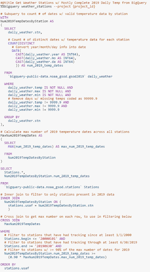
Using the “%%bigquery” magic, we can write our SQL directly in a notebook cell—with SQL syntax highlighting—and have the results returned in a pandas data frame. In the example query below, we call in the stations table into the data frame “weather_stations.” (Much of the other code ensures that results are restricted to stations that have near-complete daily data for 2019 and have several years of history.)
To explore the weather stations that were queried, use Colab’s interactive table feature, which is enabled by default with “%load_ext google.colab.data_table” in the setup. This allows sorting and filtering the table right in the notebook itself. For instance, to see how many weather stations there are in the U.S. state of Connecticut...
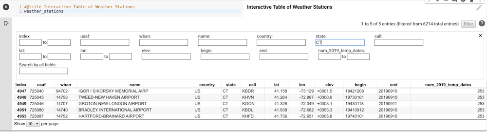
...you can see the five results right there. For reasonably sized data frames (up to tens of thousands of rows), interactive tables are a great way to do some on-the-fly data exploration quickly. There’s no need to filter the pandas data frame, write another query, or even export to Sheets—you can just manipulate the table right in front of you.
Next, let’s explore the temperature data for a specific location (note that temperatures throughout are in Fahrenheit). Colab provides a convenient way to expose code parameters with forms. In our case, we set up station USAF—the unique identifier of a weather station—as a user-modifiable form defaulting to 745090 (Moffett Federal Airfield, close to Google headquarters in the Bay Area).
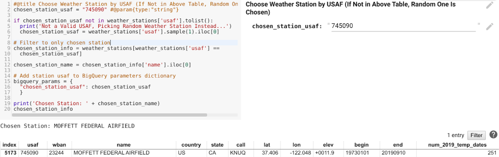
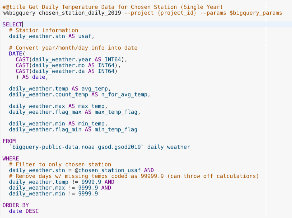
We can then pass that USAF as a BigQuery parameter in another BigQuery cell (see the additional arguments in the top line of code), querying 2019 temperature data for only the station of interest.
Now that there’s daily average, minimum, and maximum temperature data for this single station, let’s visualize it. Plotly is one library you can use to make nice interactive plots and has solid Jupyter notebook integration. Here, we used it to make a time series plot of daily data for our station of interest, using the fixed red-blue (warm-cool) color scale often associated with temperature.
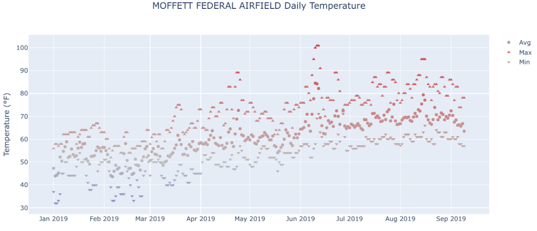
In the image, you can see a typical northern hemisphere weather pattern: cooler in the early part of the year, getting warmer from March to June, and then pretty warm to hot through the end of the data in September. In Colab, the plot is interactive, allowing you to select individual series, zoom in to specific ranges, and hover over to see the actual date and temperature values. It’s another example of how the notebook enables exploration right alongside code.
Getting more temperature data using Python to write SQL
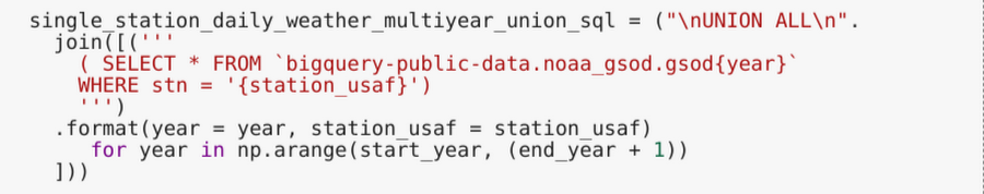
While interesting, the 2019 temperature plot doesn’t tell us much about seasonal patterns or other larger trends over longer periods of time. The BigQuery NOAA dataset goes back to 1929, but not in one single table. Rather, each year has its own table named "gsod{year}" in that dataset. To get multiple years together in BigQuery, we can "UNION ALL" a set of similar subqueries, each pointing to the table for a single year, like this:
This is repetitive to do by hand and annoying to have to recreate if the data range changes, for example. To avoid that, we’ll use the pattern of the subquery text to loop over our years of interest and create, in Python, the SQL query needed to get the data for multiple years together, like this:
Plugging that table reference into the previous query to get daily temperature data gets results, and putting those through the plotting code shows daily temperature for nearly 15 years.
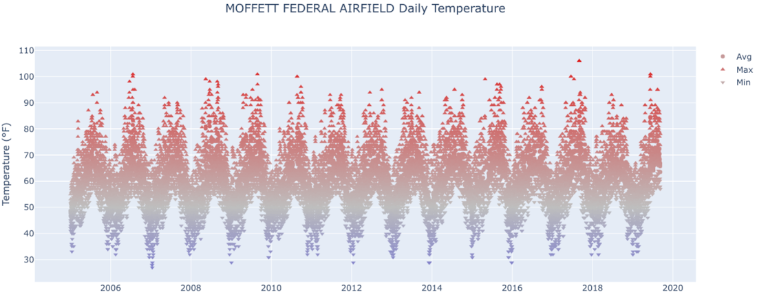
For Moffett Airfield and most other locations, you can see that there’s a regular temperature pattern of cycling up and down each year—in other words, seasons! This is a cool plot to generate for various locations around the world, using the interactive form set up earlier in the Colab. For example, try USAF 825910 (Northeast Brazil) and 890090 (the South Pole) to see two really different temperature patterns.
Fitting a sinusoidal model for temperature data
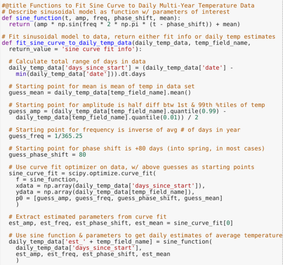
After seeing this very cyclical pattern, the next step a data scientist might take is creating a model for the temperature patterns at the location. This would give a smoothed estimate of average temperature, an estimate of the annual range in temperature, and more.
This is another task where a language like Python with solid optimization/modeling libraries can help supplement what we are doing with BigQuery. An applicable curve to fit here is a sine wave, a mathematical function that describes a smooth periodic oscillation, such as temperature moving in consistent patterns across days over years. We’ll use scipy's curve fit optimization method to estimate a sinusoidal model for the average daily temperature at a given location, as shown here:
Once the model is fit, we can draw a curve of the estimated average temperature on top of our original plot of average temperature, like so for Moffett Airfield:
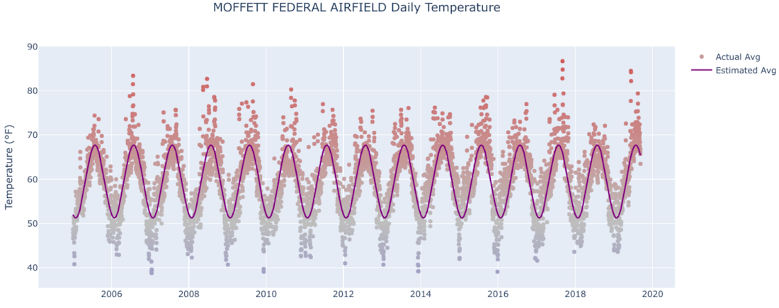
Despite some extreme observations that stick out in early summer and winter, the curve appears to be a pretty good fit for estimating average temperature on a given date of the year.
Using the model to see results at multiple locations
After running through the curve fits for a couple different stations, it looks like the model generally fits well and that the attributes of the individual curves (mean, amplitude, etc.) provide useful summary information about the longer-term temperature trends at that location. To see which places have similar temperature attributes, or find ones at the most extreme (hottest/coldest, most/least varying over the year), it would make sense to fit the model and store results for multiple weather stations together.
That said, pulling in multiple years of daily data for several weather stations would result in tens of millions of rows in Python memory, which is often prohibitive. Instead, we can loop over stations, getting the data from BigQuery, fitting the sinusoidal model, and extracting and storing the summary stats one station at a time. This is another way to use BigQuery and Python together to let each tool do what it is individually good at, then combine the results.
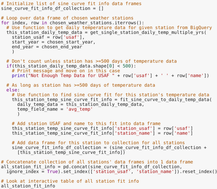
In the Colab, we fit curves to a random sample of stations (number specified by the user) and a few others selected specifically (because they are interesting), then print the resulting summary statistics in an interactive table. From there, we can sort by average temperature, highest/lowest range in annual temperature, or mean absolute error of the curve fit, and then pick out some locations to see the corresponding plots for.
For example, you see here that USAF 242660, representing Verhojansk, Russia (a town near the Arctic Circle), has an estimated range in average temperature of more than 115 degrees—among the highest in our data set. That generates the corresponding plot:
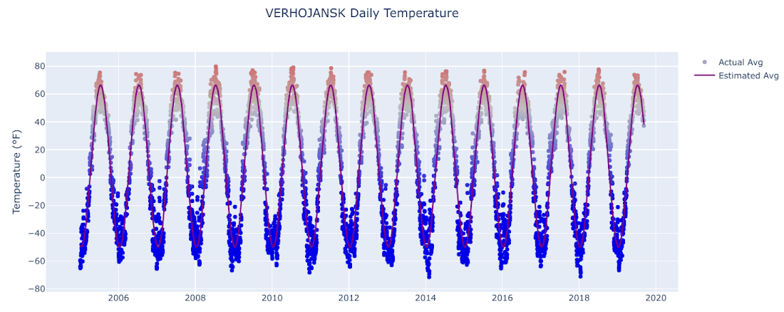
Holy amplitude! The temperature goes from the high 60s in July to nearly -50 in January, and keep in mind that that’s just the average—the min/max values are even more extreme.
Contrast that with USAF 974060, representing Galela Gamarmalamu (a place in Indonesia very close to the equator), where the model-estimated temperature range is less than one degree.
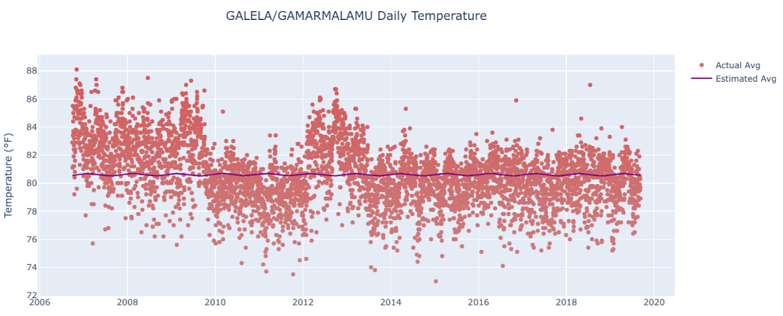
The average temperature there doesn’t really obey a cyclical pattern—it’s essentially around 80 degrees, no matter what time of the year it is.
Writing analysis results back to BigQuery
A final step in this Colab/Python and BigQuery journey is to take some of what we’ve created here and put it back into BigQuery. The summary statistics from curve fitting might be useful to have for other analyses, after all. To write out our pandas data frame results, we use the BigQuery client function "load_table_from_dataframe" with appropriate output dataset and table info.
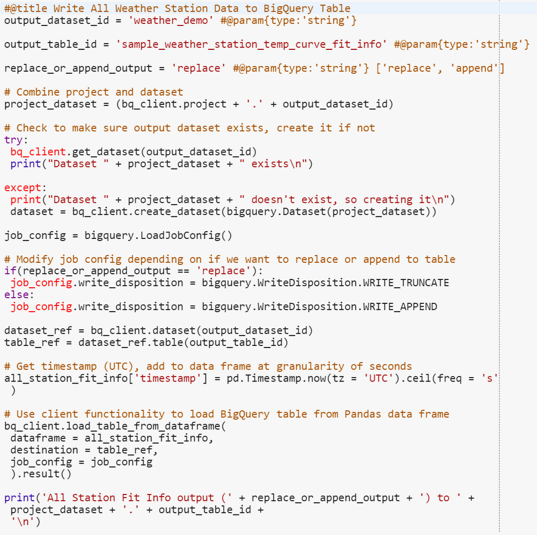
After this is done, our weather station temperature summary outputs are back in BigQuery...ready for use in the next data analysis!
Weather datasets are a great way to explore and experiment. There are many more intricate models and interesting related outputs you could get from this dataset, let alone other real-world analyses on proprietary data.
The combination of BigQuery, Python, and Colab can help you perform various data science tasks—data manipulation, exploration, modeling, prediction, and visualization—in an effective, interactive, and efficient manner.
Play around with the accompanying notebook and start doing your own data analysis with BigQuery and Colab today!