This page applies to Apigee and Apigee hybrid.
View
Apigee Edge documentation.

The API Monitoring Timeline view displays timelines of recent API traffic, to help you diagnose and investigate issues.
To access the Timeline view, follow the steps in Accessing API Monitoring and select Timeline.
The figure below shows the UI with Timeline selected.

The Timeline view displays following graphs:
- Proxy Total Traffic: Numbers of requests during 1 minute intervals of the time range.
- Proxy Error Rate: Total errors (4xx and 5xx) divided by the total traffic in each interval.
- Proxy Latencies Percentile: Percentiles for API latency. The graph shows the following percentiles: 50th (median) 90th, 95th, and 99th percentile.
- Policy Latencies Percentile
- Target Total Traffic
- Target Error Rate
- Target Latencies Percentile
Hover the mouse over any point in a graph to display the values at that point.

You can choose which graphs to display in the Graphs drop-down menu.
Graph options for all views
The following graph options are available in all three views: Timeline, Investigate, and Recent:
- ALERT: Click ALERT to set up alerts and notifications for events, such as spikes in traffic or latencies.
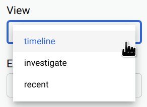
View: Select one of the API Monitoring views:
- Timeline (shown above)
- Investigate
- Recent
Graphs: Select the graphs to display from the drop-down list.
When you select the graphs, they are displayed in the order in which you selected them, starting with the most recently selected.
Time range: Select the length of the time range for the graphs.

You can also turn on Auto Refresh to automatically refresh the data once every minute.
Environment: Select the environment for the API.
Region (Timeline and Investigate views only): Select the API region.
Proxy (Timeline and Investigate views only): Select the API proxy.