이 페이지는 Apigee 및 Apigee Hybrid에 적용됩니다.
Apigee Edge 문서 보기

페이지 편집기를 사용하면 마크다운 또는 HTML을 사용하여 포털 콘텐츠를 정의할 수 있습니다.
페이지 편집기 탐색
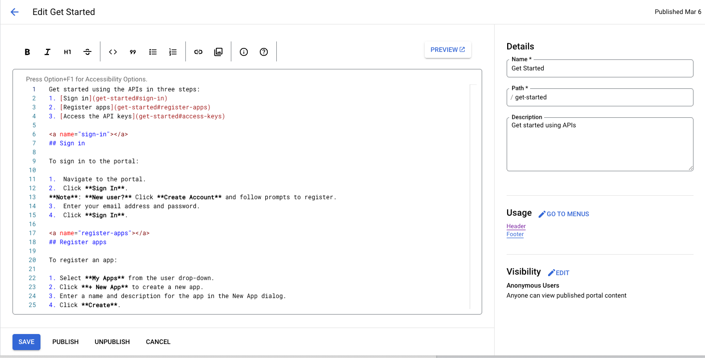
포털에서 페이지 관리에 설명된 대로 페이지 목록을 볼 때 페이지 이름을 클릭하여 페이지 편집기에 액세스합니다.
페이지 편집기가 열립니다.
Cloud 콘솔 UI
기본 UI
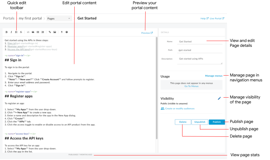
페이지 편집기에서는 다음 작업을 할 수 있습니다.
- 왼쪽 창에서 포털 콘텐츠 수정 및 Angular 머티리얼 구성요소 추가
- 빠른 수정 툴바를 사용하여 형식을 적용하거나 마크다운 태그를 빠르게 삽입
- 오른쪽 창에서 이름, 경로, 설명과 같은 페이지 세부정보 수정
- 오른쪽 창에서 페이지의 잠재고객 관리
- 포털 콘텐츠 미리보기
- 페이지 게시 또는 게시 취소(포털 콘텐츠 게시 참조)
- 탐색 메뉴에서 페이지 관리(탐색 설정 참조)
- 페이지가 마지막으로 게시된 후 경과된 시간 보기
- 페이지 삭제
페이지 편집기에서 콘텐츠 수정
마크다운은 읽기 쉽고 쓰기 쉬운 일반 텍스트 마크업을 사용하는 간단한 형식 언어입니다. 구문은 구두점 문자를 사용하여 지정됩니다. 마크다운은 브라우저에서 렌더링되기 전에 HTML로 변환됩니다.
페이지 편집기 상단의 빠른 수정 툴바를 사용하여 형식 적용(예: 굵게, 기울임꼴 등)이나 마크다운 태그(목록, 이미지, 링크 등) 삽입을 빠르게 실행할 있습니다.
빠른 수정 툴바에서 마크다운 구문에 대한 간단한 요약을 볼 수 있습니다.
Cloud 콘솔 UI
정보 아이콘을 클릭합니다.
기본 UI
아이콘을 클릭합니다.
마크다운 구문 빠른 참조가 표시됩니다.
마지막 수정사항을 실행취소하거나 다시 실행하려면 Command+z 또는 Command+Shift+z를 각각 누릅니다.
형식 지정 워크플로를 단순하게 유지하려면 마크다운을 사용하는 것이 좋습니다. 하지만 HTML을 대체하지 않습니다. 마크다운에서는 할 수 없는 HTML로 할 수 있는 형식은 매우 다양합니다. 예를 들어 HTML에서는 요소에 대한 CSS 클래스를 지정할 수 있지만 마크다운에서는 이를 수행할 수 없습니다.
<p class="class1">
HTML 태그를 입력하기만 하면 콘텐츠 본문에 HTML을 삽입할 수 있습니다.
HTML 태그에 대한 자세한 내용은 HTML5 사양을 참조하세요.
Angular 머티리얼 구성요소 추가
Angular 머티리얼은 최첨단 UI 구성요소 라이브러리를 제공합니다. Angular 머티리얼 구성요소를 사용하면 최신 설계 원칙을 활용하여 일관되고 응답성이 높으며 액세스 가능한 사용자 인터페이스를 빠르게 구성할 수 있습니다.
사용 가능한 구성요소
포털 환경은 Angular 머티리얼을 사용하여 빌드되며, 다음 표에 요약된 제한된 Angular 머티리얼 구성요소 세트를 사용할 수 있습니다.
| 구성요소 | 예 |
|---|---|
| 버튼 | 다음 코드는 고도가 있는 직사각형 버튼을 만듭니다.다음 코드는 경고 아이콘이 있는 투명한 배경의 원형 버튼을 만듭니다. 버튼의 색상은 경고 색상 팔레트를 사용하여 정의됩니다. |
| 카드 | 다음 코드는 카드를 만듭니다. 카드에는 제목 및 본문뿐만 아니라 버튼과 아이콘 구성요소가 포함됩니다. 버튼의 색상은 기본 색상 팔레트를 이용해 정의됩니다. |
| 아이콘 | 다음 코드는 체크표시 아이콘을 만듭니다. 지원되는 아이콘의 전체 목록은 머티리얼 디자인 - 아이콘을 참조하세요. |
| 툴바 | 다음 코드는 텍스트와 장바구니 아이콘이 있는 간단한 툴바를 만듭니다.
|
포털 페이지의 공개 상태 관리
포털에서 페이지 공개 상태를 관리하는 방법은 포털에서 페이지 공개 상태 관리에 설명되어 있습니다.
포털 콘텐츠 미리보기
포털 콘텐츠를 미리 보려면 다음 단계를 따르세요.
- 포털에서 페이지 관리에 설명된 대로 페이지 편집기에 액세스합니다.
페이지를 미리 봅니다.
Cloud 콘솔 UI
- 저장을 클릭합니다.
- 미리보기를 클릭합니다.
기본 UI
- 페이지 편집기 툴바에서 미리보기를 클릭합니다.
- 원하는 경우 포털의 다른 페이지를 탐색하여 콘텐츠를 미리 봅니다.
포털 콘텐츠 게시
포털 콘텐츠 게시 및 게시 취소는 포털 콘텐츠 게시에 설명되어 있습니다.
페이지 삭제
포털에서 페이지를 삭제하는 방법은 포털에서 페이지 삭제에 설명되어 있습니다.