API 流量是否突然激增或下降?哪些应用开发者最成功?您的 API 在开发者中的采用率如何?哪些 API 方法最受欢迎?Analytics 信息中心专门用于回答类似这样的问题。
在后台,Apigee 会在数据通过 API 时收集信息。信息中心提供了一种立即利用这些数据的强大方法。如果您在图或图表中看到感兴趣的内容,发现异常或突然的变化,您可以进行深入了解,挖掘尽可能多的详细情况。如果您发现某个开发者遇到了大量错误或流量突然下降,您可以主动联系该开发者。您可以通过信息中心深入了解您的 API,以便采取相应行动。
接收数据的延迟间隔是多少?
我可以自定义信息中心吗?
是的,有许多信息中心可供您选择要分析的指标、日期范围、数据汇总间隔以及许多其他变量。如果内置信息中心无法满足您的需求,您可以通过选择分析性维度和要分析的指标来创建自定义报告。利用自定义报告,您可以展开 API 分析数据的细目,直到实现所需的粒度。
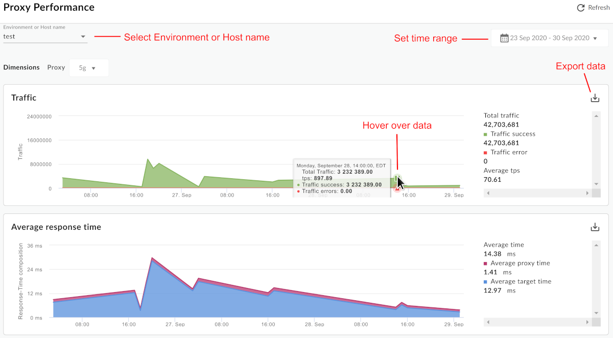
[[["易于理解","easyToUnderstand","thumb-up"],["解决了我的问题","solvedMyProblem","thumb-up"],["其他","otherUp","thumb-up"]],[["很难理解","hardToUnderstand","thumb-down"],["信息或示例代码不正确","incorrectInformationOrSampleCode","thumb-down"],["没有我需要的信息/示例","missingTheInformationSamplesINeed","thumb-down"],["翻译问题","translationIssue","thumb-down"],["其他","otherDown","thumb-down"]],["最后更新时间 (UTC):2025-09-03。"],[[["\u003cp\u003eApigee Analytics dashboards provide a quick overview of API ecosystem changes, helping users identify issues and take swift corrective actions.\u003c/p\u003e\n"],["\u003cp\u003eThe dashboards enable users to analyze API traffic patterns, developer success rates, and API method popularity, offering insights to answer key questions about API usage.\u003c/p\u003e\n"],["\u003cp\u003eWhile data is collected in real-time, it may take up to 10 minutes for API call data to appear in dashboards, custom reports, and management API calls.\u003c/p\u003e\n"],["\u003cp\u003eUsers can customize dashboards by selecting metrics, date ranges, and data aggregation intervals, and create custom reports for in-depth analysis.\u003c/p\u003e\n"],["\u003cp\u003eDashboards include common features like time range selection, zoom, data export, and mouse-over details, ensuring consistency across different dashboard types.\u003c/p\u003e\n"]]],[],null,["# Using the analytics dashboards\n\n*This page\napplies to **Apigee** and **Apigee hybrid**.*\n\n\n*View [Apigee Edge](https://docs.apigee.com/api-platform/get-started/what-apigee-edge) documentation.*\n\nAnalytics dashboards help you see and detect changes in your API ecosystem at a glance. The\nability to see what has changed over time helps you identify problems and take corrective action\nquickly.\n\nFor a quick overview of API Analytics, who uses them, and why, see\n[Apigee API Analytics overview](/apigee/docs/api-platform/analytics/analytics-services-overview).\n| **Note:** There is a limit to the amount of data that can be reported in\n| the Analytics dashboards. If the amount of analytics data returned by the query exceeds this\n| limit, then the dashboard will display the results for a partial set of data and a warning will\n| be displayed on the dashboard (Public Cloud only).\n|\n| As an alternative, you can export analytics data from Apigee Analytics to your own data repository,\n| such as Google Cloud Storage or BigQuery. You can then take advantage of the powerful query and machine\n| learning capabilities offered by Google Cloud BigQuery and TensorFlow to perform your own data analysis.\n| See [Export data from Analytics](/apigee/docs/api-platform/analytics/export-data) for more.\n\nWhat can you learn from the dashboards?\n---------------------------------------\n\nHas there been a sudden spike or drop off in API traffic? Which app developers are most\nsuccessful? What is the adoption rate of your API among developers? Which API methods are most\npopular? The Analytics dashboards are designed specifically to answer questions like\nthese.\n\nIn the background, Apigee collects information as data passes through your APIs. The\ndashboards provide a powerful way to use this data immediately. If you see something of interest\nin a graph or chart, an anomaly or sudden change, you can then drill deeper to uncover as much\ndetail as you require. If you notice that a particular developer is experiencing a lot of errors\nor a sudden drop in traffic, you can contact that developer proactively. Dashboards give you\ninsight into your APIs that allows you to take action.\n\nWhat's the delay interval for receiving data?\n---------------------------------------------\n\n\n| **Note:** **Data delay interval** \n| After API calls are made to proxies, it may take up to **10 minutes** for the data to appear in dashboards, custom reports, and management API calls.\n\n\u003cbr /\u003e\n\nCan I customize the dashboards?\n-------------------------------\n\nYes, many dashboards let you select which metrics to analyze, date ranges, data aggregation\nintervals, and many other variables. If the built-in dashboards do not suit your needs, you can\ncreate [custom reports](/apigee/docs/api-platform/analytics/create-custom-reports), which are dashboards you create by\nselecting the analytic dimensions and metrics that you wish to analyze. Custom reports let you\n\"drill down\" into your API's analytic data until you achieve the granularity you require.\n\nWhat are the most common features in the dashboards?\n----------------------------------------------------\n\nDashboards have a set of common features, including setting time range, click and drag zooming on charts,\nmouse-over hover for more details on charts and other regions, and selectors for choosing the data\nto display in a chart. If you understand how to use one kind of dashboard, you'll be comfortable using the others.\n| **Note:**For the specific features of each dashboard, view the documentation for that dashboard.\n\nThe following figure highlights these common feature areas:\n\n- **Environment or Host name** - Select the environment or host name in the organization.\n- **Set the time range** - Set the time range over which the dashboard\n displays its data.\n\n | **Note:** For Cloud-based installations, data older than six months from the current date is not accessible by default. If you want to access data older than six months, contact [Google Cloud Customer Care](https://cloud.google.com/support-hub/).\n- **Zoom in** - You can zoom in on chart data by clicking and dragging a region of the chart. When you complete the drag, the chart zooms in to the selected region.\n- **Export data to file** - Download a single CSV file that contains the set of data for the chart.\n- **Hover mouse over graphs** - You can mouse over any point on a graph for more context about the data at that point."]]