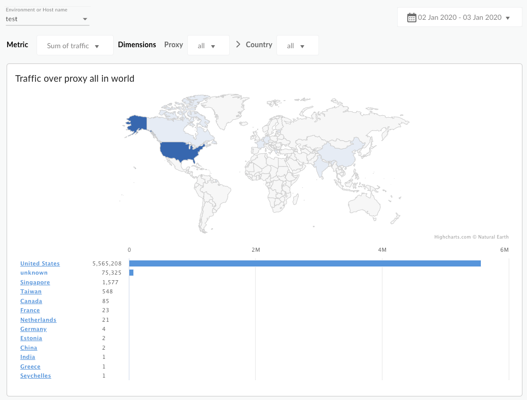
기본적으로 대시보드에는 트래픽 합계 측정항목이 표시됩니다. 다음 표에서는 Geomap 대시보드에서 추적하는 각 측정항목을 설명합니다.
측정항목
설명
트래픽 합계
처리량이라고도 합니다. 조직에서 볼 수 있는 API 요청 수와 결과 응답 수입니다.
오류 수 합계
실패한 모든 API 요청의 총 개수입니다. 즉, 요청은 최종 사용자가 원하는 응답을 제공하지 않습니다.
평균 총 응답 시간
API가 수신 요청에 응답하는 데 걸리는 시간입니다.
평균 대상 응답 시간
선택한 기간 동안 대상 엔드포인트가 수신 요청에 응답하는 데 걸리는 평균 시간입니다.
대시보드 사용
대시보드에는 표시된 정보를 필터링하는 데 사용할 수 있는 드롭다운 메뉴 세트가 있습니다. 필터 드롭다운 메뉴는 동적입니다.
예를 들어 '환경' 드롭다운에서 환경을 선택하면 해당 환경과 연결된 모든 프록시, 호스트 이름, 국가, 리전이 다른 드롭다운 메뉴, 차트, 표에서 자동으로 선택됩니다.
자세한 내용은 Looker Studio 문서의 필터 속성 정보를 참조하세요.
날짜 선택기를 사용하여 측정할 시작일과 종료일을 선택합니다. 날짜 선택기를 사용하면 일 단위로만 날짜를 선택할 수 있습니다. 하루보다 작은 기간 단위를 선택할 수 없습니다.
지도는 대화형 방식으로 이루어집니다. 국가를 클릭하여 해당 국가의 트래픽을 확인합니다. 데이터 테이블을 마우스 오른쪽 버튼으로 클릭하여 데이터 정렬 및 내보내기와 같은 작업을 할 수 있습니다.
를 참조하세요.
이 대시보드에 관해 알아두어야 할 다른 사항은 무엇인가요?
기본적으로 대시보드에는 모든 API 프록시의 측정항목이 표시됩니다. 프록시 드롭다운 메뉴에서 측정할 API 프록시를 선택할 수도 있습니다.
국가 및 지리적 리전 목록에서 항목을 선택하여 특정 국가, 주, 도시(관심 있는 국가의 특정 지역에 따라 다름)를 드릴다운합니다.
예를 들어 미국 데이터를 보고 지리적 리전을 선택한 다음 트래픽이 생성되는 도시 목록을 볼 수 있습니다. 테이블에서 도시 이름을 클릭하면 해당 도시의 트래픽을 확인할 수 있습니다.
이 대시보드는 날짜 선택기, 맵 위로 마우스를 가져가서 추가 컨텍스트 확인하기, 데이터를 CSV로 내보내기 등의 표준 컨트롤을 사용합니다. 자세한 내용은 분석 대시보드 사용을 참조하세요.
Looker Studio에서 사본 만들기
Looker Studio에서 대시보드 사본을 수정, 저장, 공유할 수 있습니다. 시작하려면 다음 안내를 따르세요.
Looker Studio에서 사본 만들기를 클릭합니다.
드롭다운 메뉴에서 복사할 보고서를 선택합니다.
Looker Studio에서 저장 및 공유를 클릭합니다.
확인 및 저장을 클릭합니다.
이제 사용자 계정에 저장된 사본을 수정할 수 있습니다. Looker Studio를 사용하여 보고서를 수정하고 만드는 방법에 관한 자세한 내용은 Looker Studio 문서를 참조하세요.
[[["이해하기 쉬움","easyToUnderstand","thumb-up"],["문제가 해결됨","solvedMyProblem","thumb-up"],["기타","otherUp","thumb-up"]],[["이해하기 어려움","hardToUnderstand","thumb-down"],["잘못된 정보 또는 샘플 코드","incorrectInformationOrSampleCode","thumb-down"],["필요한 정보/샘플이 없음","missingTheInformationSamplesINeed","thumb-down"],["번역 문제","translationIssue","thumb-down"],["기타","otherDown","thumb-down"]],["최종 업데이트: 2025-08-18(UTC)"],[[["\u003cp\u003eThe Geomap dashboard in Apigee and Apigee hybrid tracks API traffic patterns, error rates, and service quality across different geographical locations, allowing users to assess API growth, error trends, and quality of service by country.\u003c/p\u003e\n"],["\u003cp\u003eAccessing the Geomap dashboard is done via the Apigee UI in the Cloud console or the classic Apigee UI, with required IAM roles for Cloud console access.\u003c/p\u003e\n"],["\u003cp\u003eThe dashboard displays metrics such as "Sum of traffic," "Sum of error count," "Average of total response time," and "Average of target response time" to provide insights into API performance.\u003c/p\u003e\n"],["\u003cp\u003eThe dashboard is interactive, offering filtering options by environment, proxy, hostname, country, and region and allows drilling down to specific cities, but data may have a delay of up to 10 minutes to appear.\u003c/p\u003e\n"],["\u003cp\u003eUsers can create, edit, and share a copy of the Geomap dashboard in Looker Studio, but any changes made in Looker Studio are not reflected back in the original Apigee dashboard.\u003c/p\u003e\n"]]],[],null,["# Geomap dashboard\n\n*This page\napplies to **Apigee** and **Apigee hybrid**.*\n\n\n*View [Apigee Edge](https://docs.apigee.com/api-platform/get-started/what-apigee-edge) documentation.*\n\n| **Dashboard availability:** This dashboard is not available if your Apigee organization was provisioned with compliance-related Apigee features, such as [data residency](/apigee/docs/api-platform/get-started/drz-concepts), [CMEK](/apigee/docs/api-platform/get-started/cmek-concepts), and [workforce identity federation](/apigee/docs/api-platform/system-administration/workforce-identity-federation-apigee#accessing-features-only-available-in-the-classic-apigee-ui).\n\nWhat does this dashboard tell me?\n---------------------------------\n\nThe Geomap dashboard tracks traffic patterns, error patterns, and quality of service across\ngeographical locations. You can view information about all your APIs, or zoom in on specific\nones. This dashboard helps you assess:\n\n- **API growth trends** - Use the **Sum of traffic metric** to see where your traffic is coming from. By using different time periods you can see which countries generate the most traffic at which times. You can also record traffic rates over different time periods to see trends in growth.\n- **Error trends** - Use the **Sum of error count** metric to see where API errors are coming from. By using different time periods you can see which countries generate the most errors at which times. You can also record error rates over different time periods to see trends in growth.\n- **Quality of service** - Use the **Average of total response\n time** and **Average of target response time** metrics to see how your backend services are performing by country.\n\n\n| **Note:** **Data delay interval** \n| After API calls are made to proxies, it may take up to **10 minutes** for the data to appear in dashboards, custom reports, and management API calls.\n\n\u003cbr /\u003e\n\nThe Geomap Dashboard\n--------------------\n\n| **Required roles:** To access the **Geomap** dashboard, you must have the following IAM predefined roles:\n|\n| - `roles/apigee.analyticsViewer`\n| - `roles/apigee.analyticsEditor`\n| - `roles/apigee.addonsconfig.get`\n|\n| For more information, see [How to specify a predefined role](/apigee/docs/api-platform/get-started/permissions#expandable-1).\n\nTo access the Geomap dashboard:\n\nIn the Google Cloud console, go to the **Analytics \\\u003e End user analysis \\\u003e Geomap** page.\n\n[Go to Geomap](https://console.cloud.google.com//apigee/analytics/enduser/geomap)\n\nThe dashboard opens as shown:\n\nWhat does this dashboard measure?\n---------------------------------\n\nBy default, the dashboard displays the **Sum of traffic** metric. The following table\ndescribes each of the metrics tracked by the Geomap dashboard:\n\nUsing the dashboard\n-------------------\n\nThe dashboard has a set of dropdown menus that you\ncan use to filter the information shown in it. The filter dropdown menus are dynamic.\nFor example, if you select an environment from the Environments dropdown, then any proxies,\nhostnames, countries, and regions\nassociated with that environment are automatically selected in the other dropdown menus, charts, and tables.\nFor more information, see\n[About filter properties](/looker/docs/studio/about-filter-properties) in\nthe Looker Studio documentation.\n\nUse the date selector to pick a start and end date to measure. The date selector only\nlets you select dates in day increments. You can't select a time range increment\nthat is smaller than a day.\n\nThe map is interactive. Click a country to see traffic for that country. You can right-click\na data table for actions like sorting and exporting data.\n| **Note:** Seeing a dimension entity named ***(not set)*** ? For more information, see [What does an analytics entity named (not set) mean?](/apigee/docs/api-platform/analytics/why-am-i-seeing-analytics-entity-named-not-set)\n\nWhat else do I need to know about this\ndashboard?\n-------------------------------------------------\n\nBy default, the dashboard displays metrics for all API proxies. Alternatively, select an API proxy to\nmeasure from the **Proxies** dropdown menu.\n\nSelect an entry under the **Countries** and **Geographical regions** lists\nto drill down on specific countries, states, and cities (depending on the specific geography of the country you are interested in).\nFor example, you can look at\nUnited States data, then select a geographical region, and then view a list of cities from which traffic is\ngenerated. You can click a city name in the table to see traffic for that city.\n\nThis dashboard uses standard controls, like the date selector, hovering over maps for more\ncontext, exporting data to CSV, and so on. To learn more, see\n[Using the analytics dashboards](/apigee/docs/api-platform/analytics/using-analytics-dashboards).\n\nMake a copy in Looker Studio\n----------------------------\n\nYou can edit, save, and share a copy of the dashboard in\n[Looker Studio](/looker/docs/studio/new-studio-docs). To get started:\n\n1. Click **Make a copy in Looker Studio**.\n2. From the dropdown menu, select the report you wish to copy.\n3. In Looker Studio, click **Save and share**.\n4. Click **Acknowledge and save**.\n\nYou can now edit the copy saved in your user account. For details on using\nLooker Studio to edit and create reports, see the [Looker Studio\ndocumentation](/looker/docs/studio/about-reports).\n| **Note:** Any changes you make in Looker Studio are not reflected back in the Apigee dashboard."]]